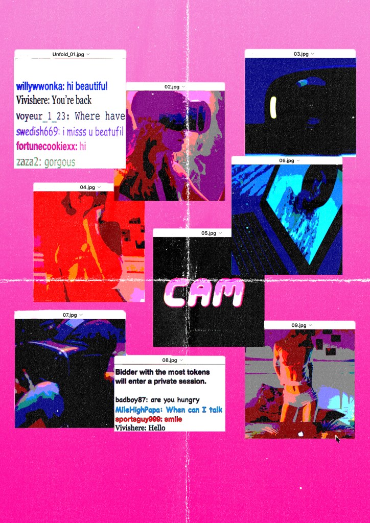
This post will fracture the pieces that I want to showcase in the exhibition and in what format, size.
I know in total I want thee pieces to represent different topics that I made a response to. I want these to have an impact I would want them to be A2 because my piece are not grand enough to be A1 or A0 but I want them to have a poster like feel to each piece. The following order of the images are how I would like them to be presented. In a Tryptic.
For paper finishes and weight, I would go for a Semi-gloss finish because of how it would go along with the textures and overlay in my images due to the shine that the finish provides. For weight, I would go with the standard 215 gsm. As it’s known to be poster paperweight and I want the pieces to be really lightweight or super heavy.
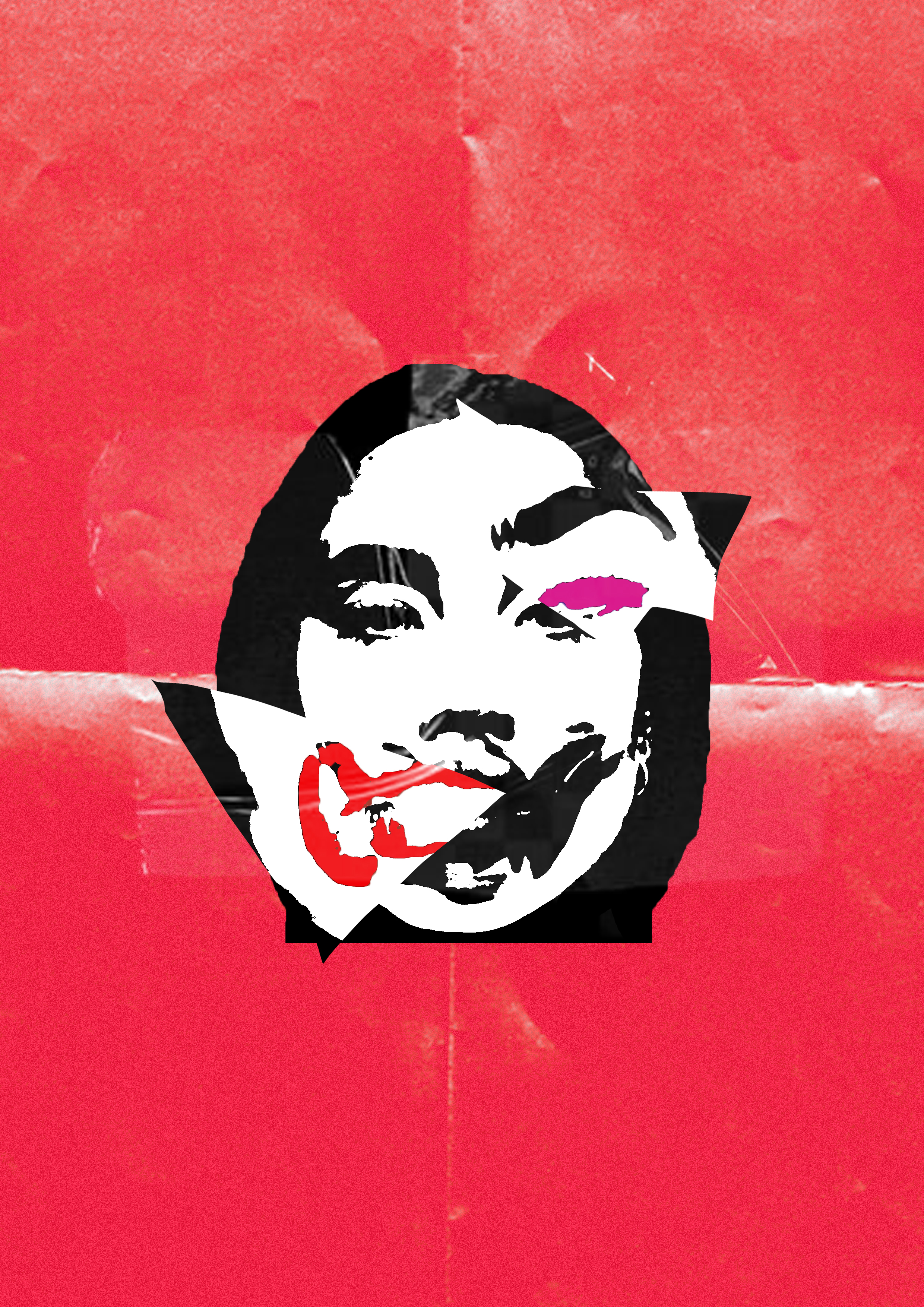
Broken Faces:
I want to feature this piece in the exhibition because I think this piece was a shift in how I presented my work in this project.
Even though this piece was hard to communicate the meaning behind it. I would have one of those cards to the left of the piece. Explaining that tho piece is alluding to plastic surgery and how it has become the norm to get something done.
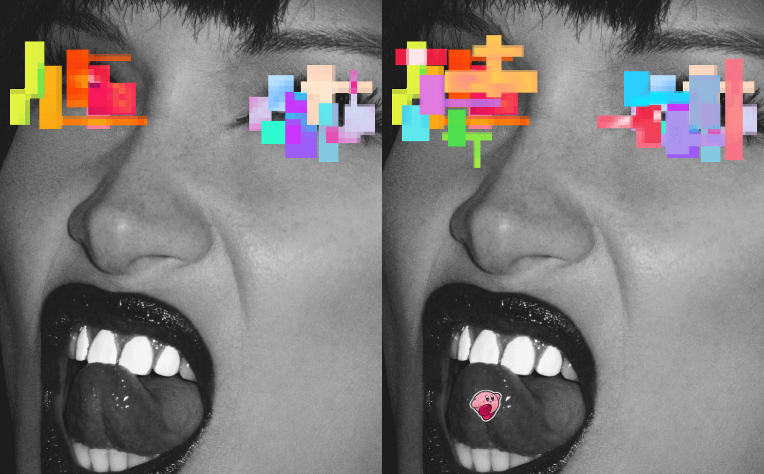
A Glitch In The System
This piece would be my second feature in the exhibition but due to my circumstances, it’s not. I was planning to turn this piece in a similar style to the two other pieces so that it would be coherent.
Instead of being a static image like the other two, it would still be a GIF. So I present it in the middle of the two images by projection.
I situated it in the middle because even though my idea for the project had evolved. This piece still has elements that I quite like.
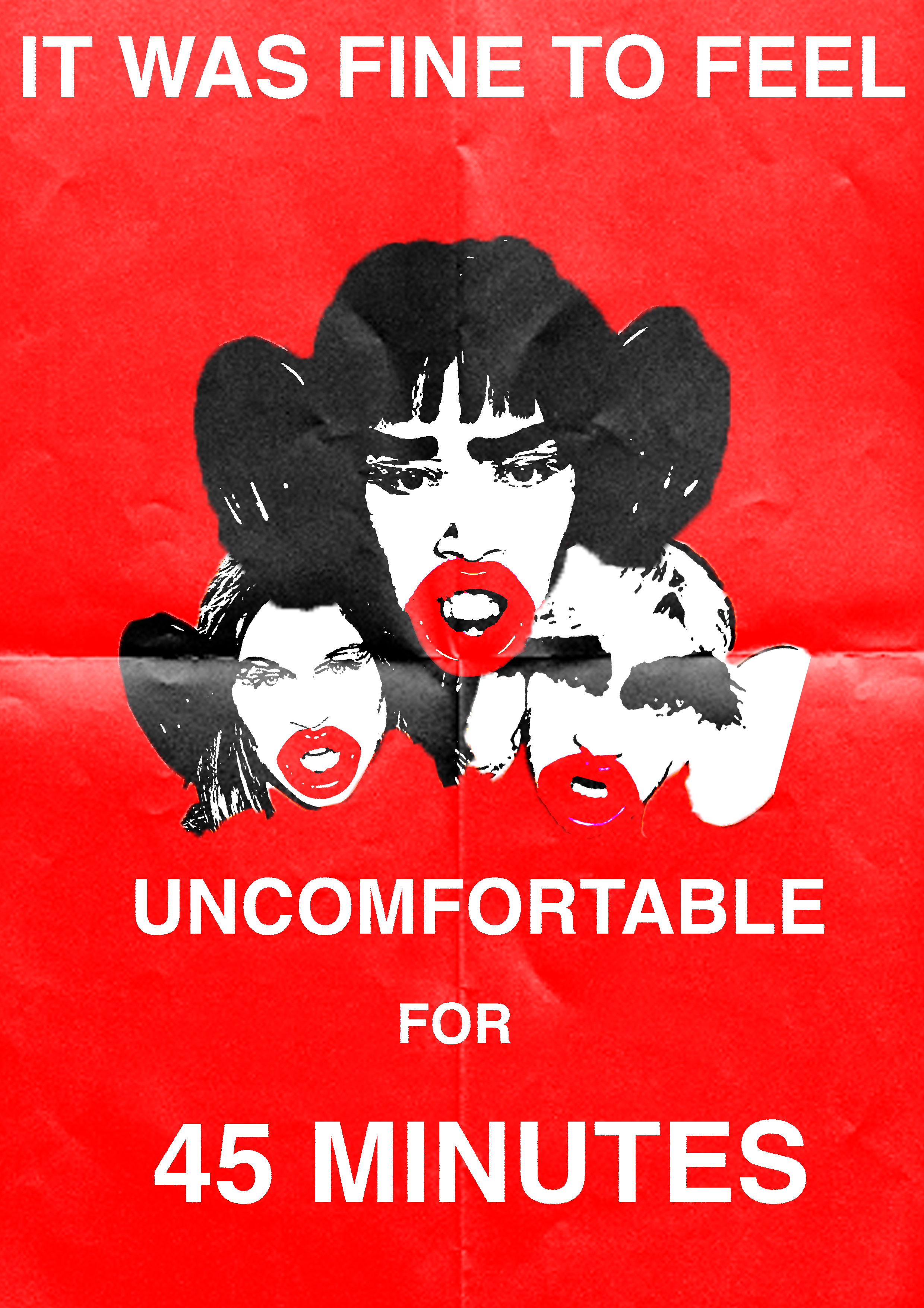
45 minutes
To be honest, this piece is my standout of the entire project. I was getting into a good rhythm of picking topics that I can address. I picked a topic that is personal to me that I could pick a lot of emotion into
The description card would be on the right side of the image it would explain how this is a response to the incident that happened when an undergraduate student for their final show decided to us to use blackface as an accessory for the show.