Categories
Exhibition

Exhibition Pieces

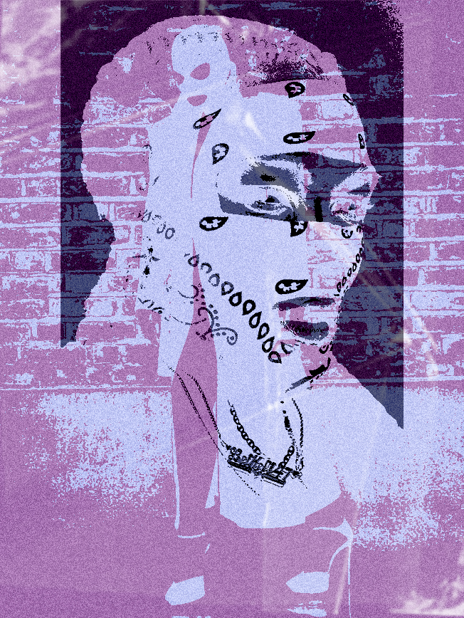
This post will fracture the pieces that I want to showcase in the exhibition and in what format, size.

I know in total I want thee pieces to represent different topics that I made a response to. I want these to have an impact I would want them to be A2 because my piece are not grand enough to be A1 or A0 but I want them to have a poster like feel to each piece. The following order of the images are how I would like them to be presented. In a Tryptic.

For paper finishes and weight, I would go for a Semi-gloss finish because of how it would go along with the textures and overlay in my images due to the shine that the finish provides. For weight, I would go with the standard 215 gsm. As it’s known to be poster paperweight and I want the pieces to be really lightweight or super heavy.
Broken Faces:

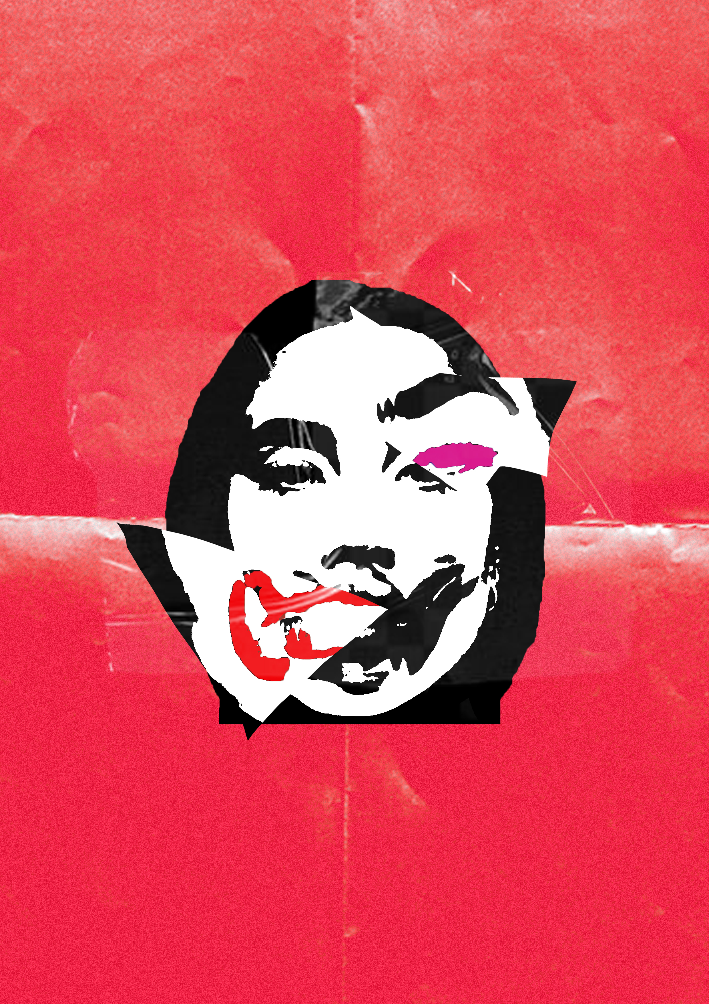
I want to feature this piece in the exhibition because I think this piece was a shift in how I presented my work in this project.

Even though this piece was hard to communicate the meaning behind it. I would have one of those cards to the left of the piece. Explaining that tho piece is alluding to plastic surgery and how it has become the norm to get something done.
A Glitch In The System

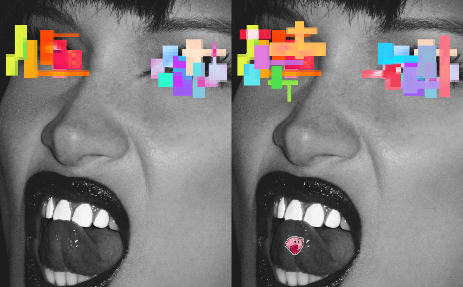
This piece would be my second feature in the exhibition but due to my circumstances, it’s not. I was planning to turn this piece in a similar style to the two other pieces so that it would be coherent.

Instead of being a static image like the other two, it would still be a GIF. So I present it in the middle of the two images by projection.

I situated it in the middle because even though my idea for the project had evolved. This piece still has elements that I quite like.
45 minutes

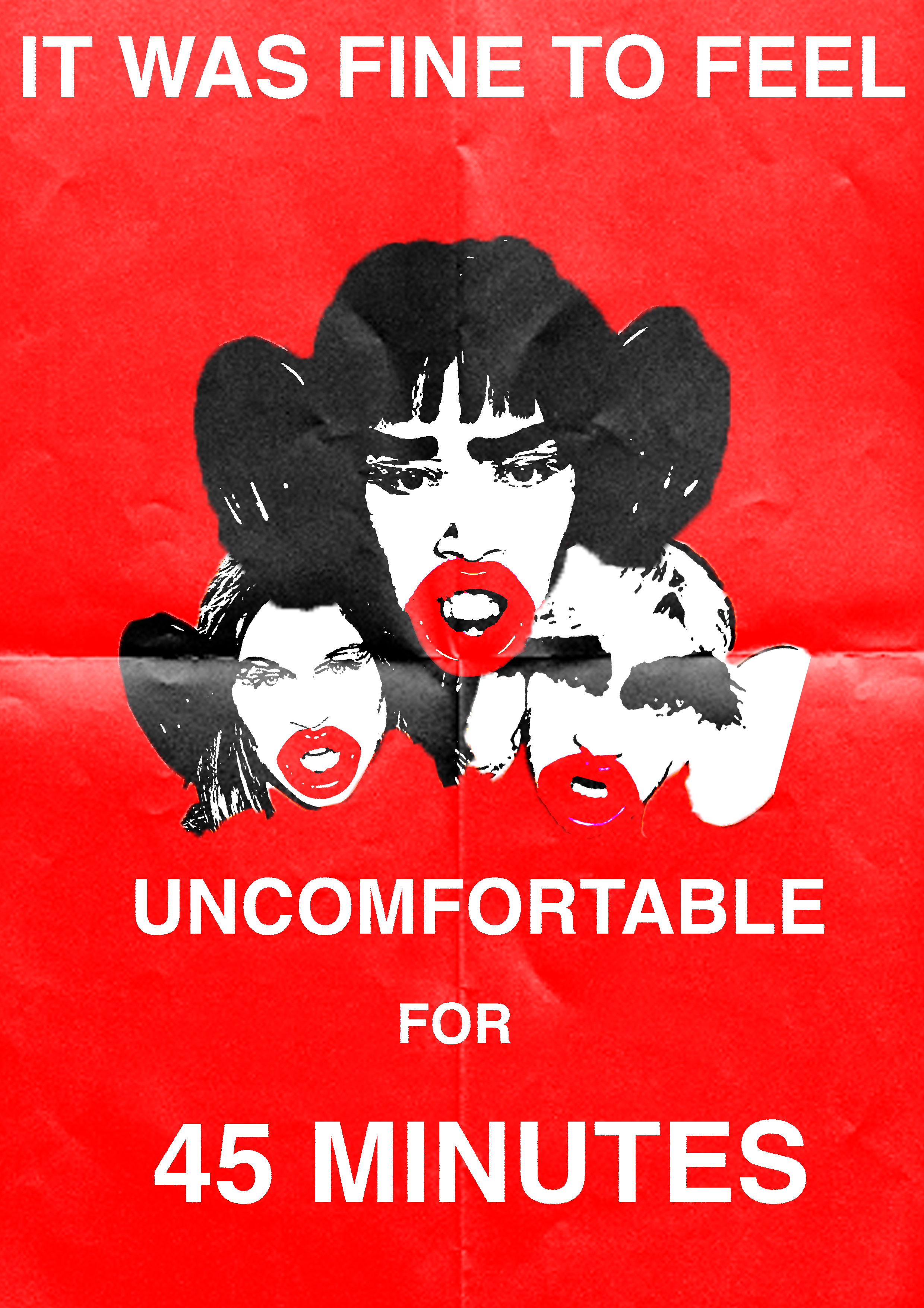
To be honest, this piece is my standout of the entire project. I was getting into a good rhythm of picking topics that I can address. I picked a topic that is personal to me that I could pick a lot of emotion into

The description card would be on the right side of the image it would explain how this is a response to the incident that happened when an undergraduate student for their final show decided to us to use blackface as an accessory for the show.
Categories
Survival & Synthetic Synthetic

Synthetic

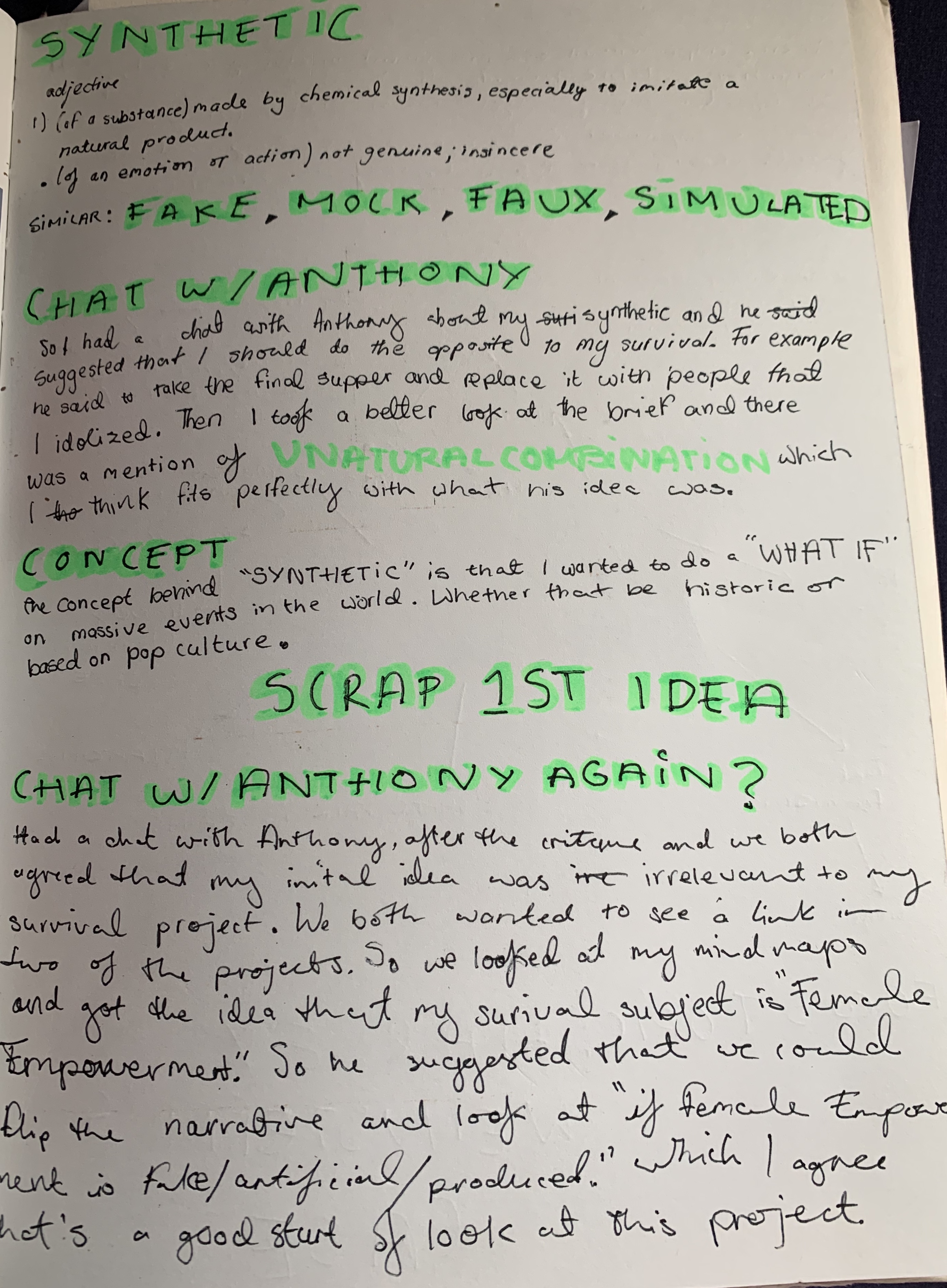
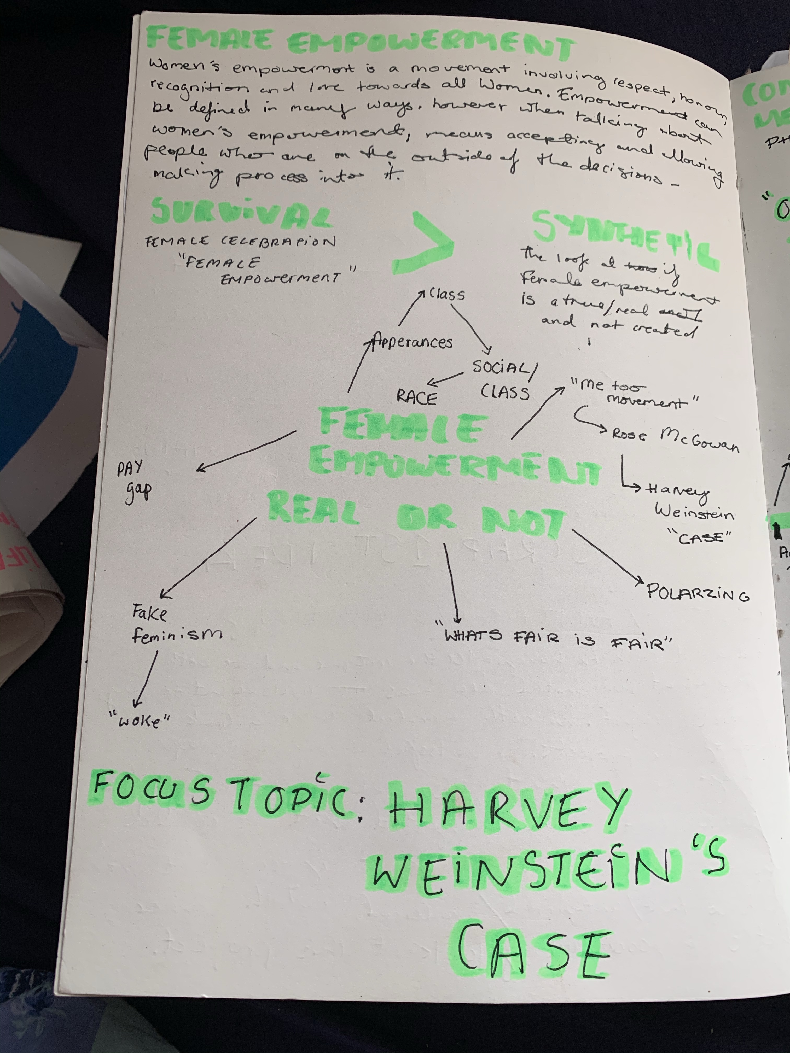
For this project, I wanted to link my survival with this project. So the idea was to look at “if female Empowerment is fake/artificial/produced.

Focus Topic: Harvey Weinstein’s Case

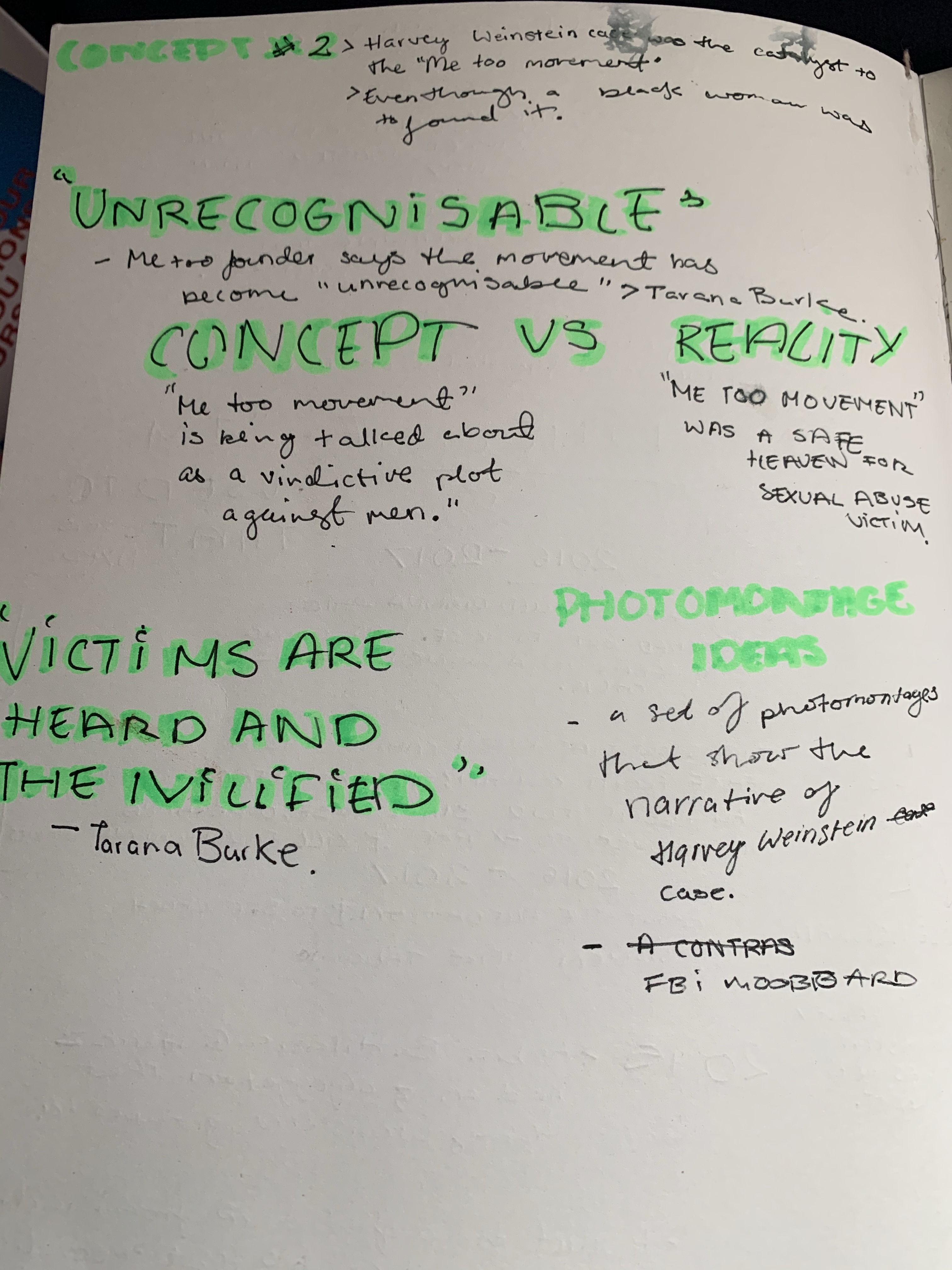
I took that idea and applied it to the Harvey Weinstein case because his case was the catalyst to the “Me Too Movement. The idea of it wasn’t for this man in power getting exposed for his abuse than the movement wouldn’t have gained as much friction as it did.

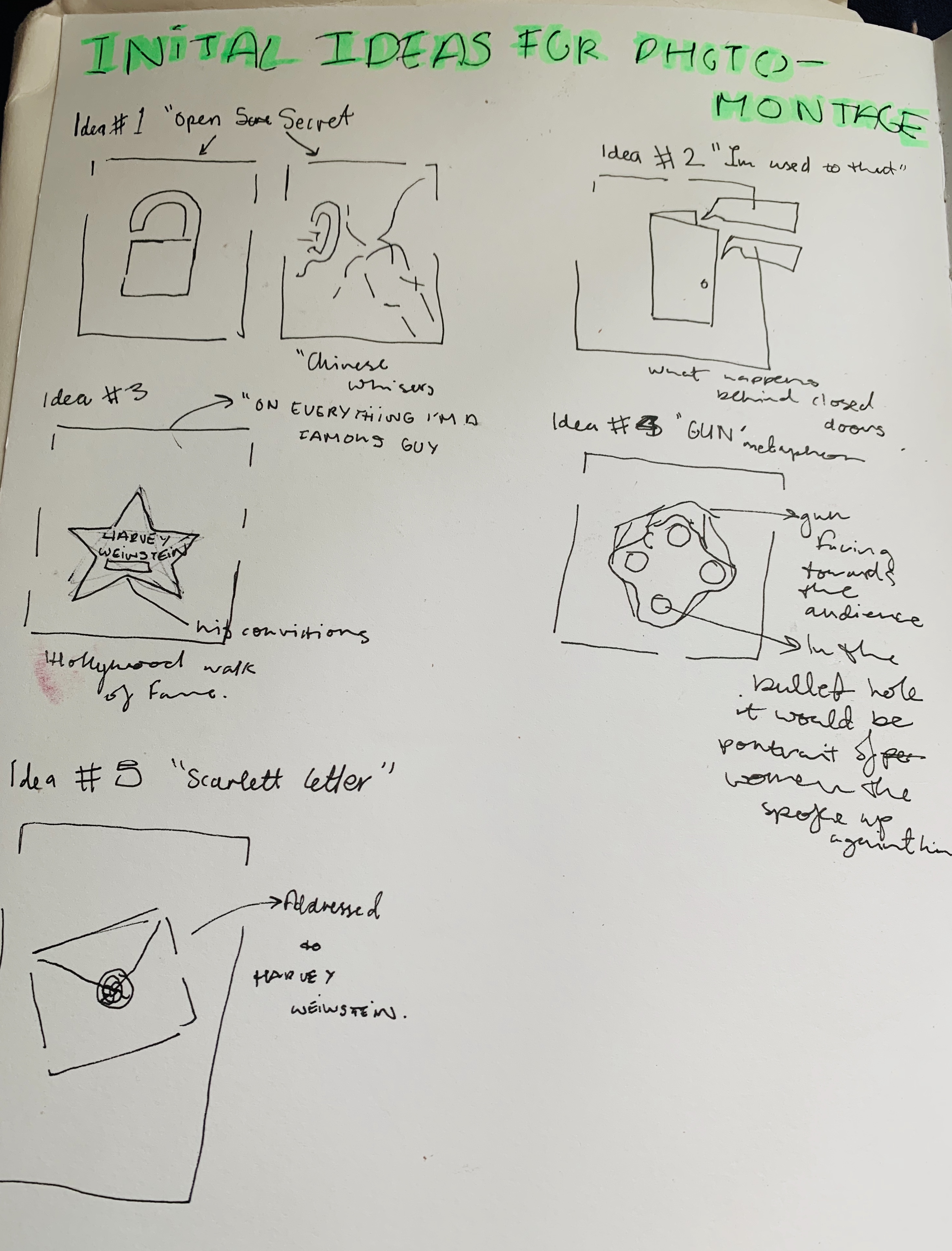
Initial Ideas for photomontages:

With these thumbnails, I wanted the imagery to be on the nose. To be really clear on what I’m talking about because of how sensitive this topic is.

Photomontages

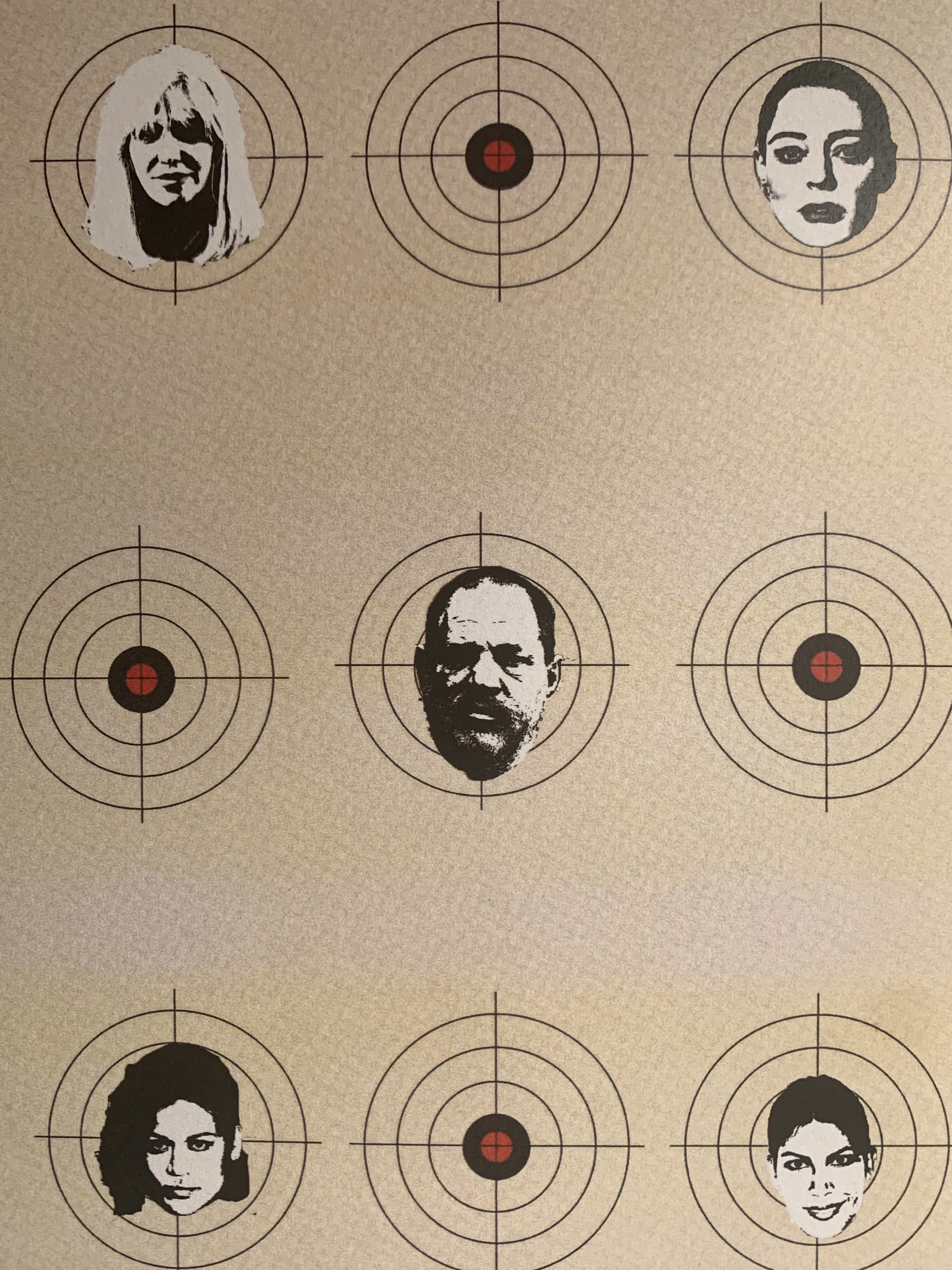
This piece was based on some of the women that targeted Harvey Weinstein.

Rose McGowan, who initially started the wave in 2016-2017 to take down Weinstein in a series of tweets that exposed him of sexually assaulting her.

Courtney Love, publicly mentioned on a red carpet that “If Harvey Weinstein invites you to a dinner party don’t go”. This was way before the “Me Too Movement” but it was a well-known secret that Harvey Weinstein abused his power to sexually assault women in the industry.

Tarale Wally & Miriam Haley are 2 out of the 6 women that testified against Harvey Weinstein in court and ultimately got him.

I think with this piece I wanted to be a reversal so instead of it being Harvey Weinstein targeting women it would b the other way around. Women targeting him for all the harm that he’s done.

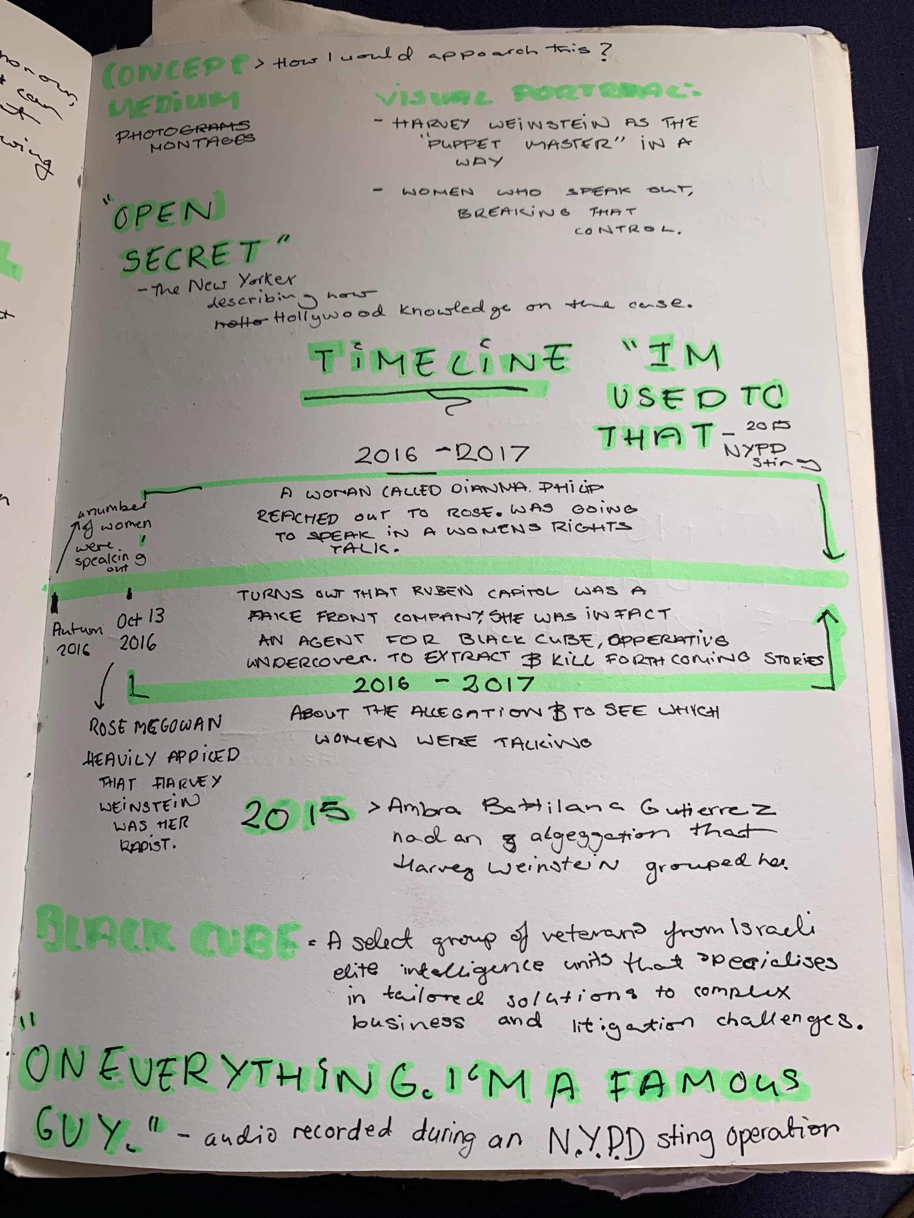
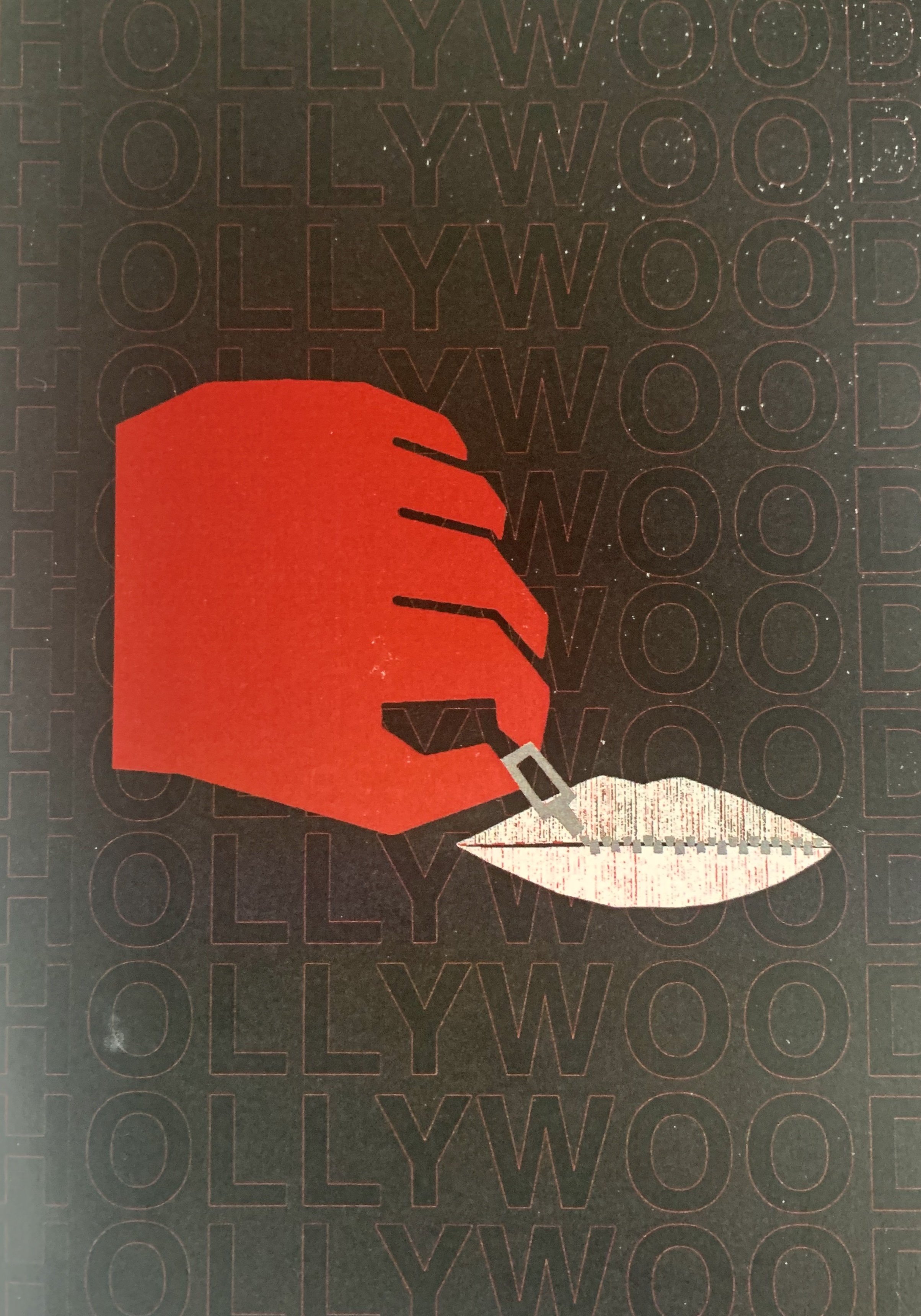
This piece is a visual representation of how Hollywood already knew what was going on about Harvey Weinstein but continued to be silent because of how powerful he was. The New Yorker describes the whole situation best say it was an “OPEN SECRET”.

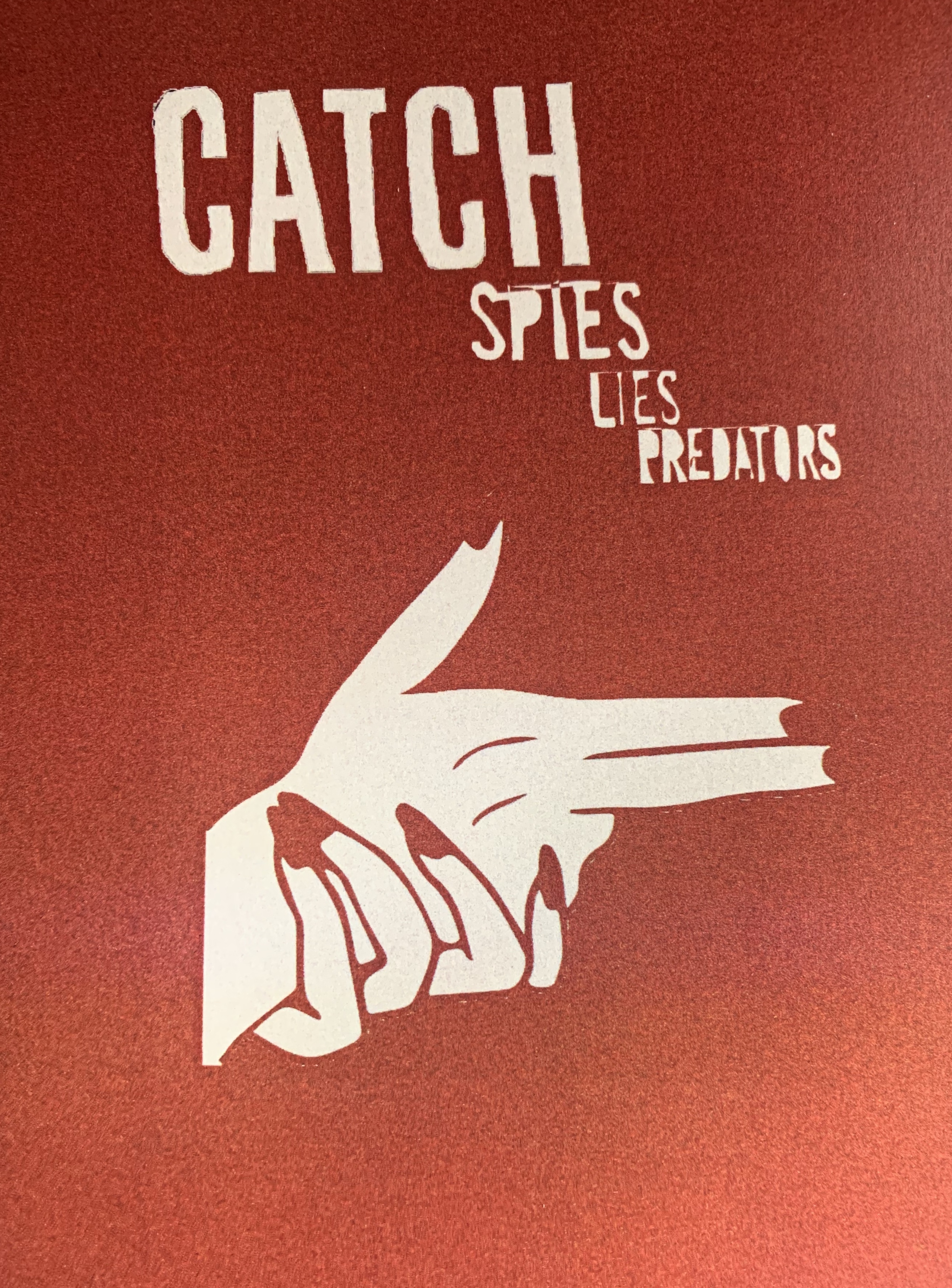
This piece references the whole fact that during 2016-2017 more and more news started to come out of Harvey Weinstein’s misconduct so to destroy all these allegations. Harvey Weinstein acquired this group to spy on women. Like Rose McGowan and kill any forthcoming stories.

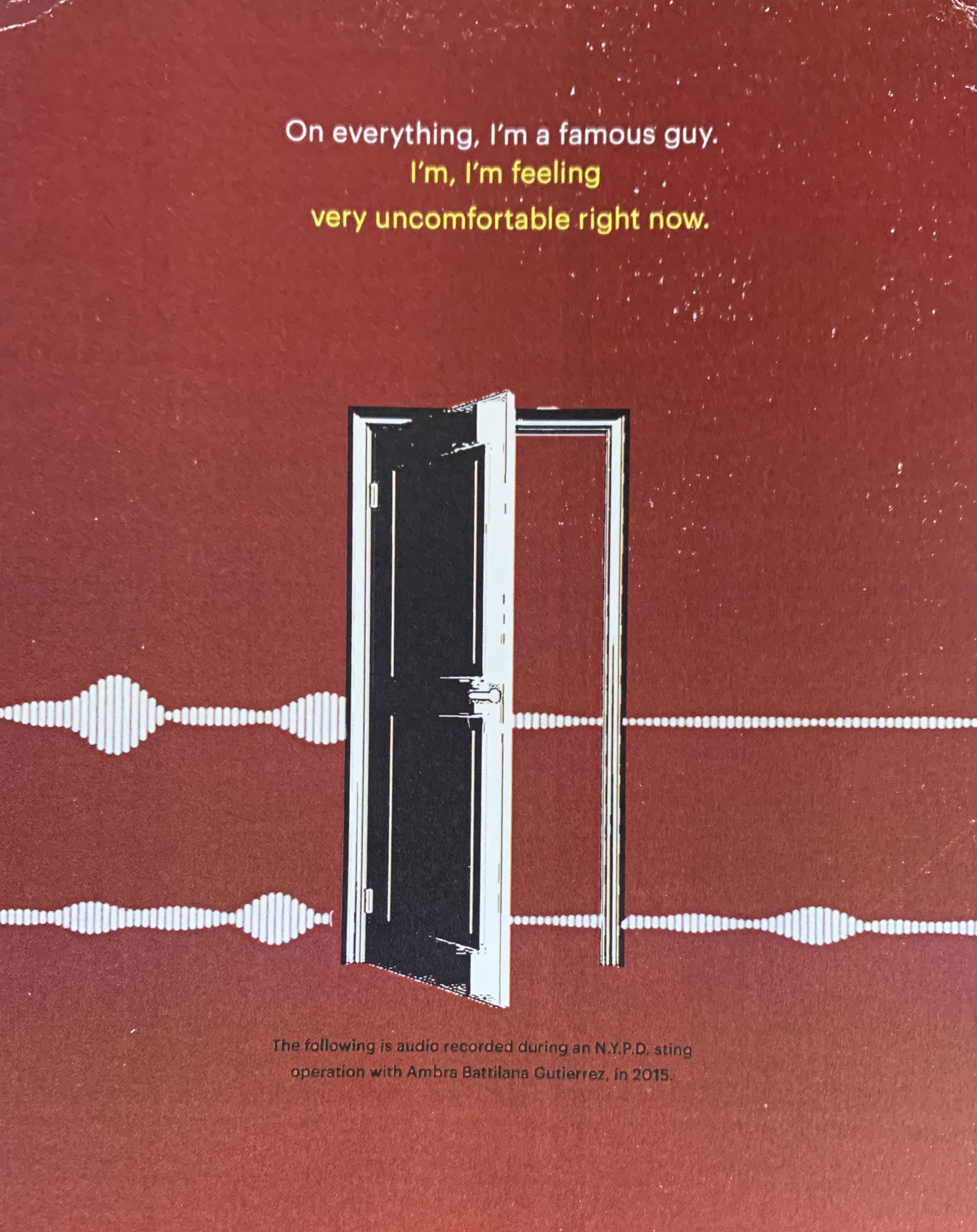
For this photo montage, I wanted to allude to the idea of ‘what’s behind the door’ kind of like what happens in the dark mentality. During 2015 NYPD operated a sting operation against Harvey Weinstein. Getting audio like this, “ON EVERYTHING IM A FAMOUS GUY” and “IM USED TO THAT”. I wanted to visual how trapped Ambra Battilana must have felt during this whole situation.

Categories
Survival Survival & Synthetic

Survival

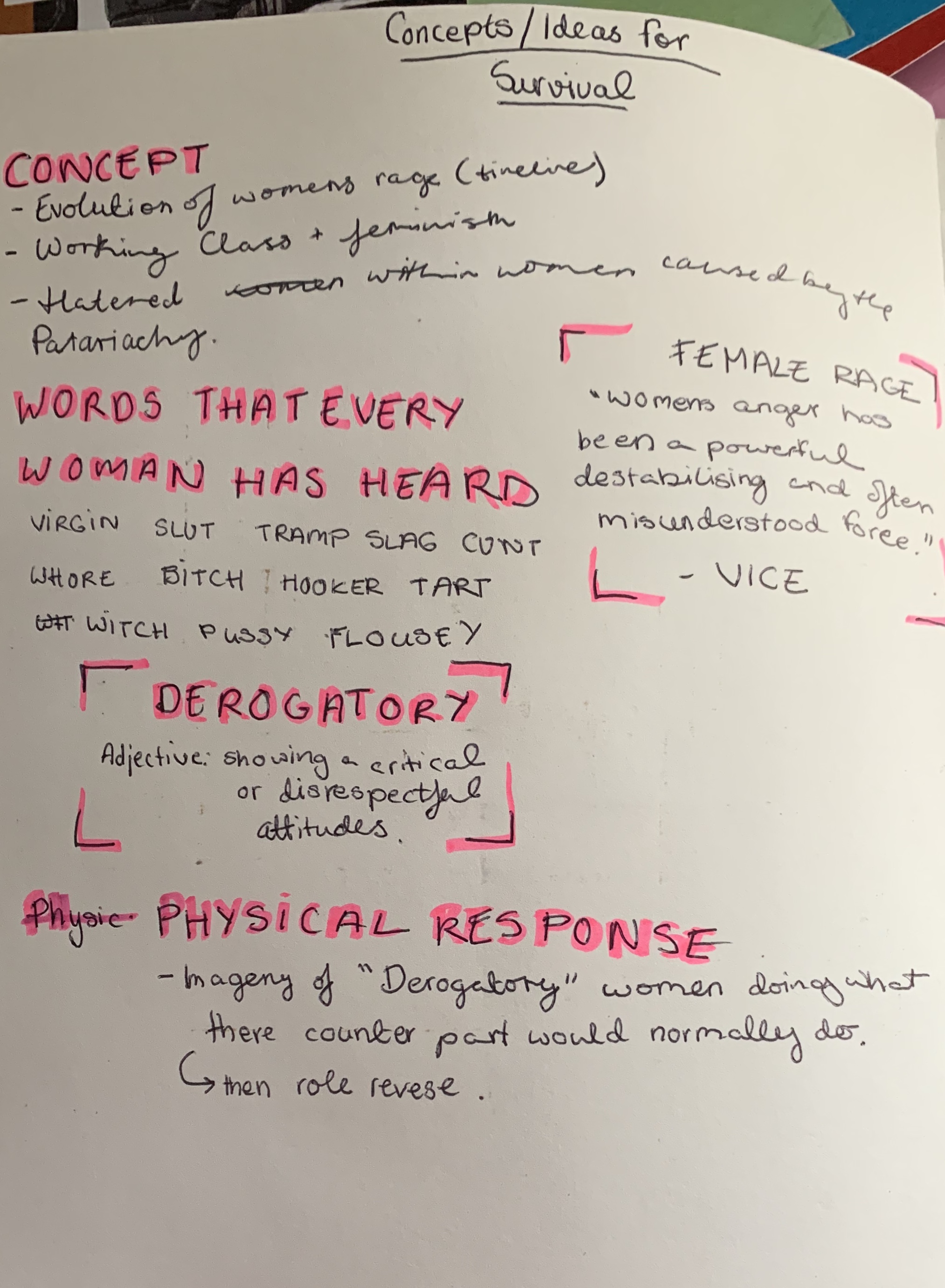
Concepts for this project:

• Evolution of women rage (timeline) • Working Class and feminism. • Hatred that women have against each other because of the Patriachy

The Idea For This Project:

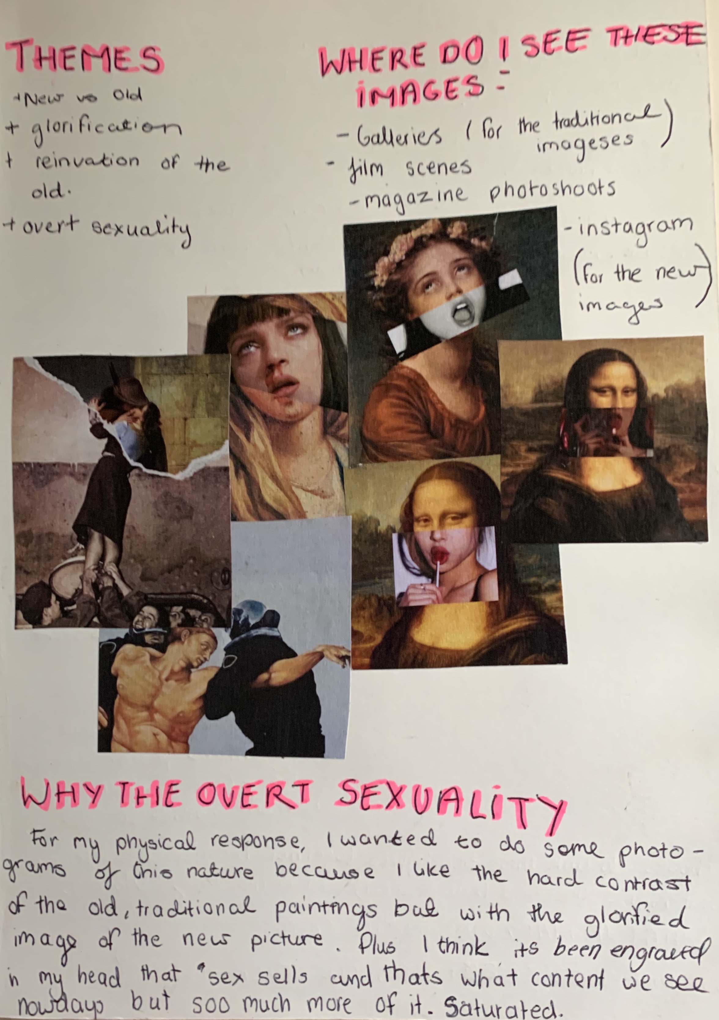
The initial idea was that I take these really traditional artworks and rework them to have a counterpart that would be more ’glorified’ in away.

Photo montages:

A series of photomontages that go with the initial idea.

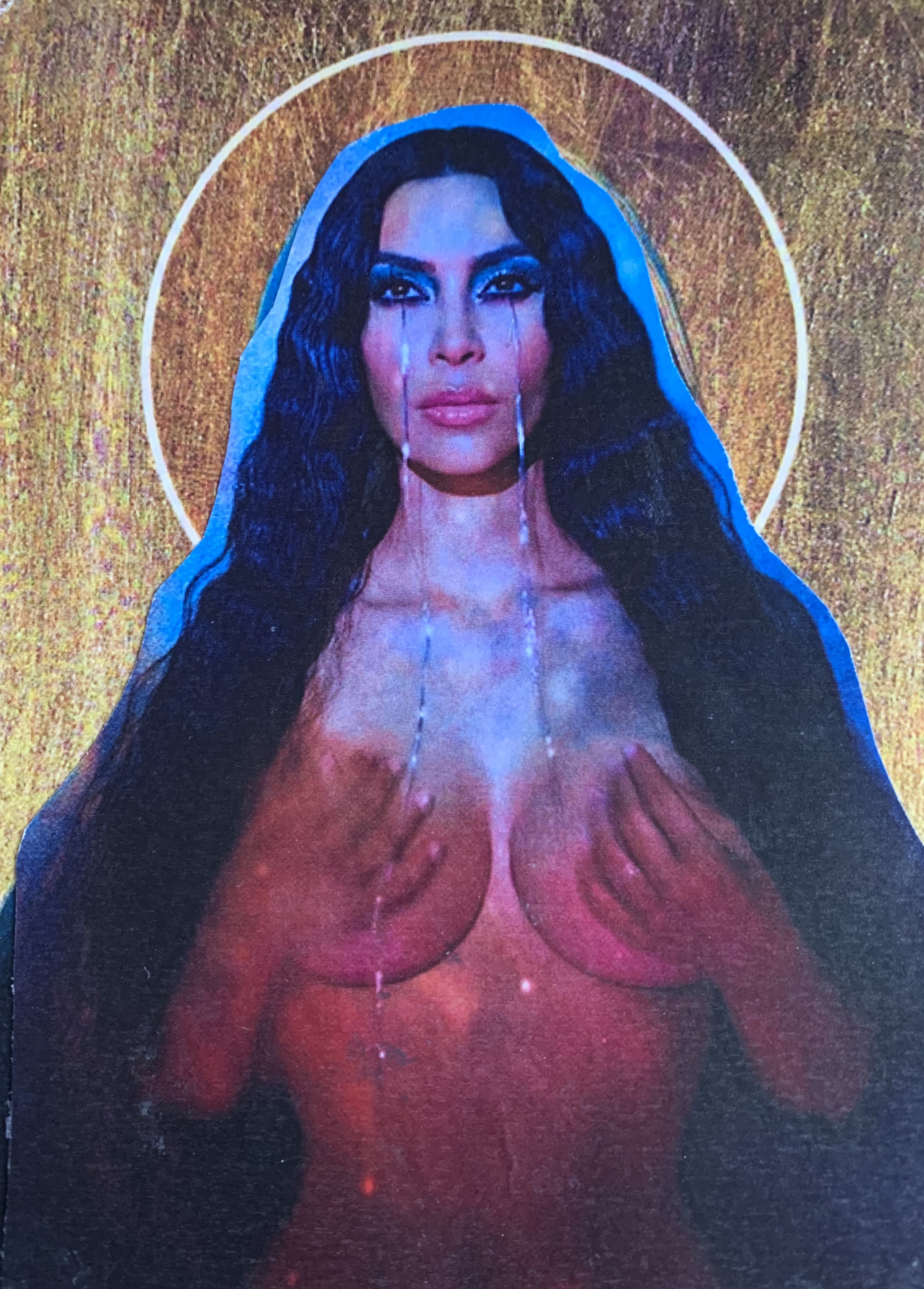
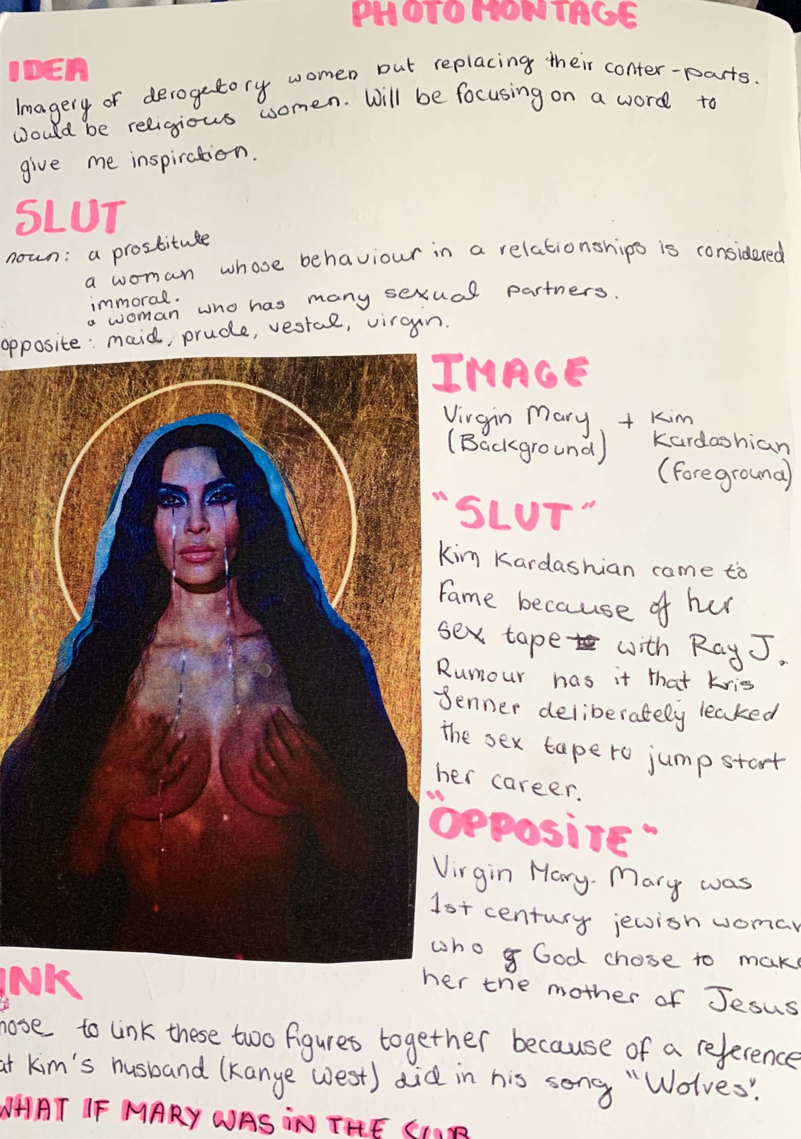
Kim Kardashian as the Virgin Mary: The idea for this piece is that I chose a specific word to look at. The word was SLUT. The meaning behind the word is a woman who is considered immoral because of her sexual relations. Kim Kardashian came to fame because of her sex tape and has been called a slut throughout her career. Virgin Mary: Virgin Mary is the complete opposite of Kim Kardashian. She’s pure, a vestal.

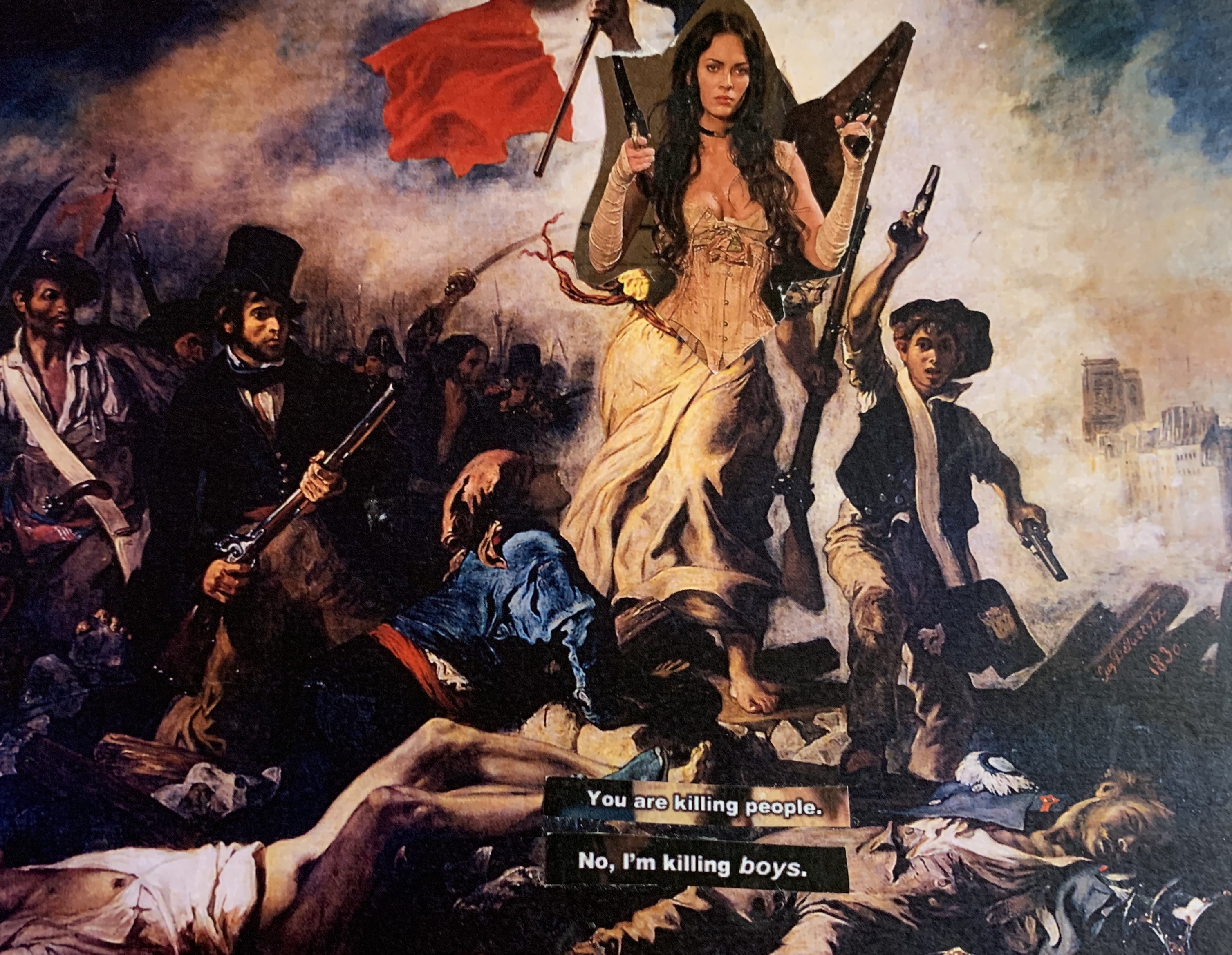
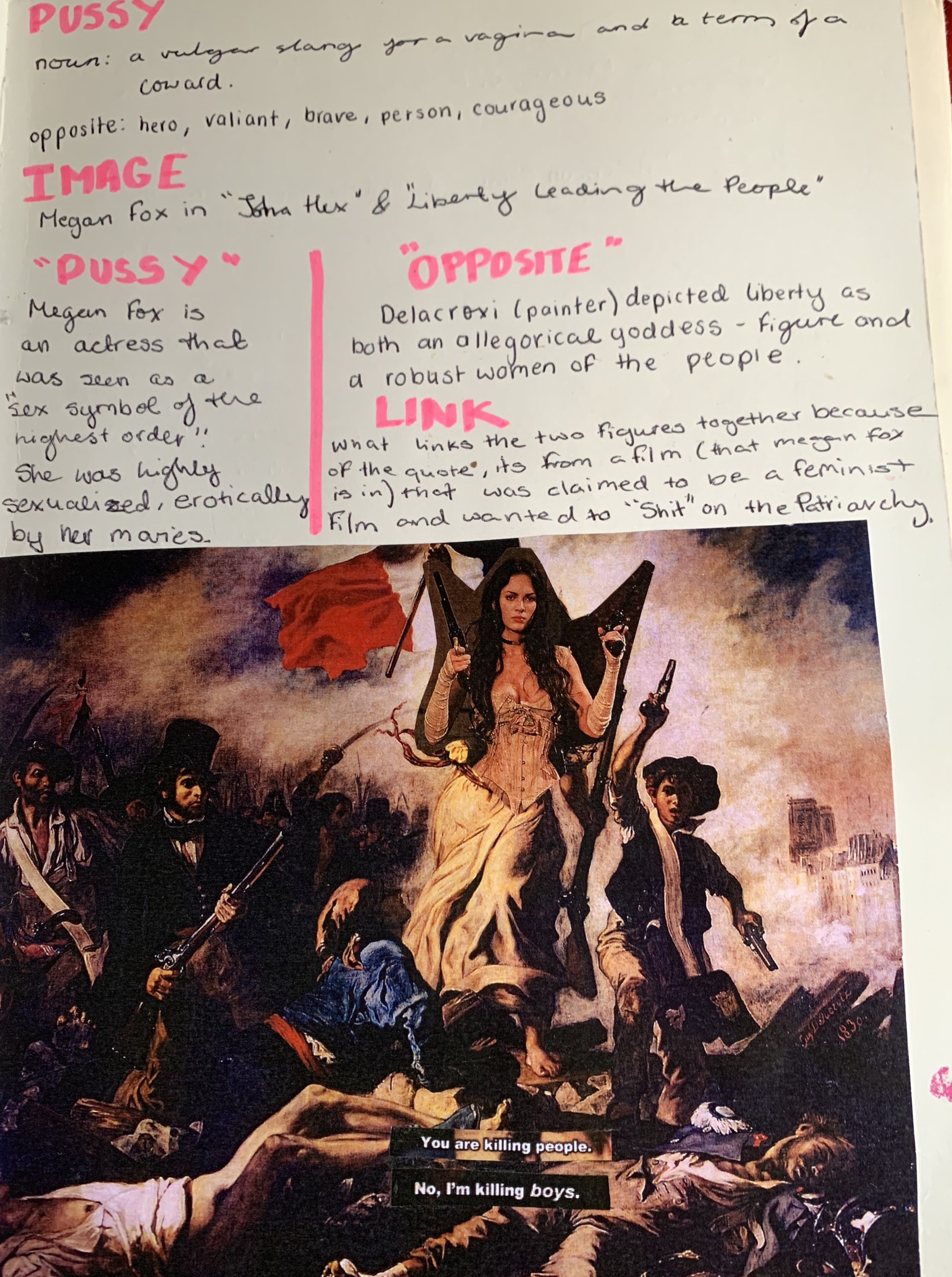
Megan Fox as Lady Liberty: The word I chose to focus on for this piece was the word ’PUSSY’. The word can be used as a vulgar term for a vagina or a term to call someone a coward. In terms of why I linked this word to Megan Fox. Megan Fox is an actress that was seen as a ’sex symbol’ and nothing else. Throughout her career, she’s been fighting with directors, producers over her sexualization in the media.

Lady Liberty: Delacroxi depicted Liberty as both an allegorical goddess figure and a robust woman of the people. I think what links these two figures together was that fact that there both fighting for a cause. To mention the quote on the bottom. It was from a film that Megan Fox did and becamea cult classic of hers. It was claimed to be a feminist film and I wanted to kind of say ’Fuck you to the patriarchy’.

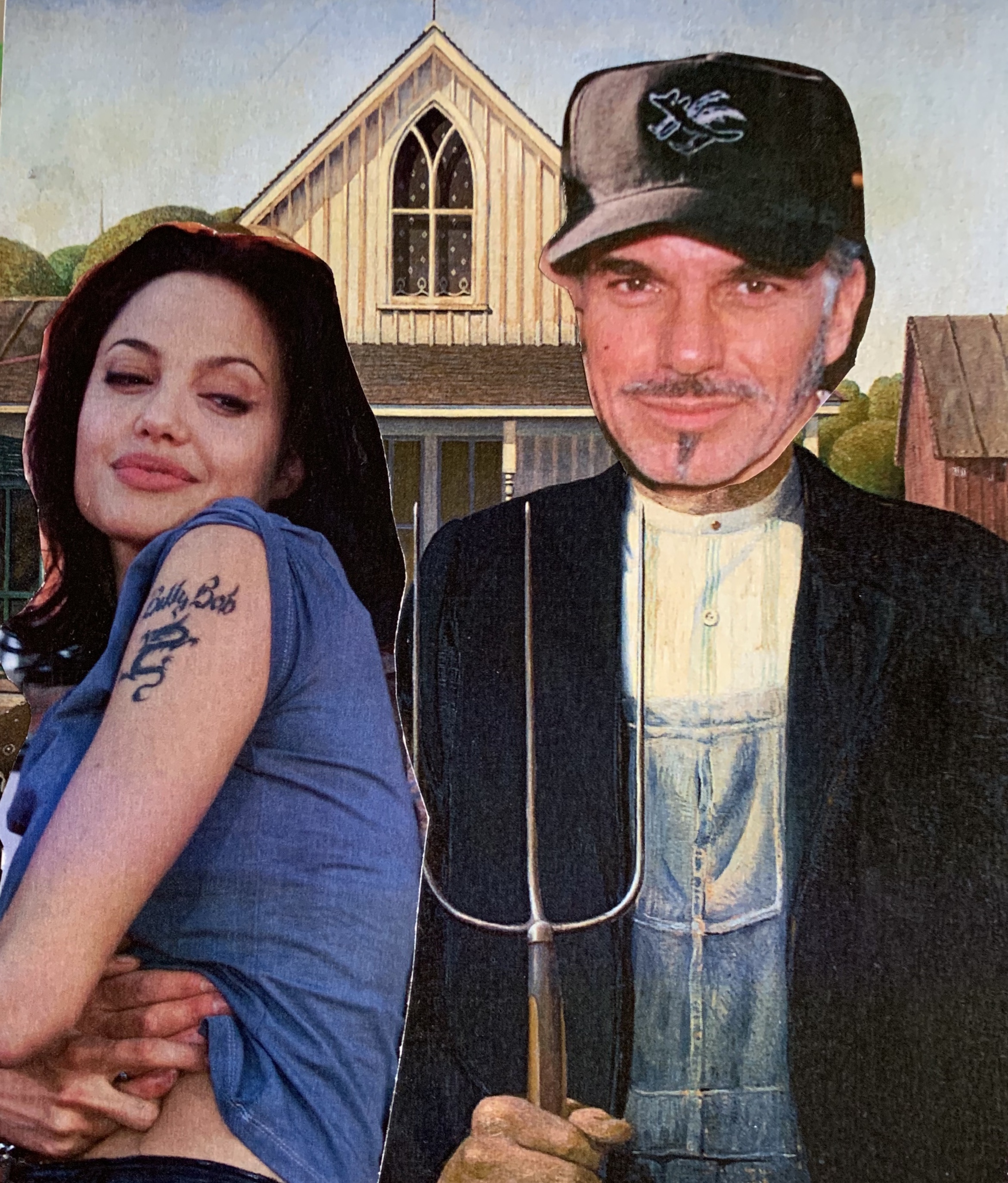
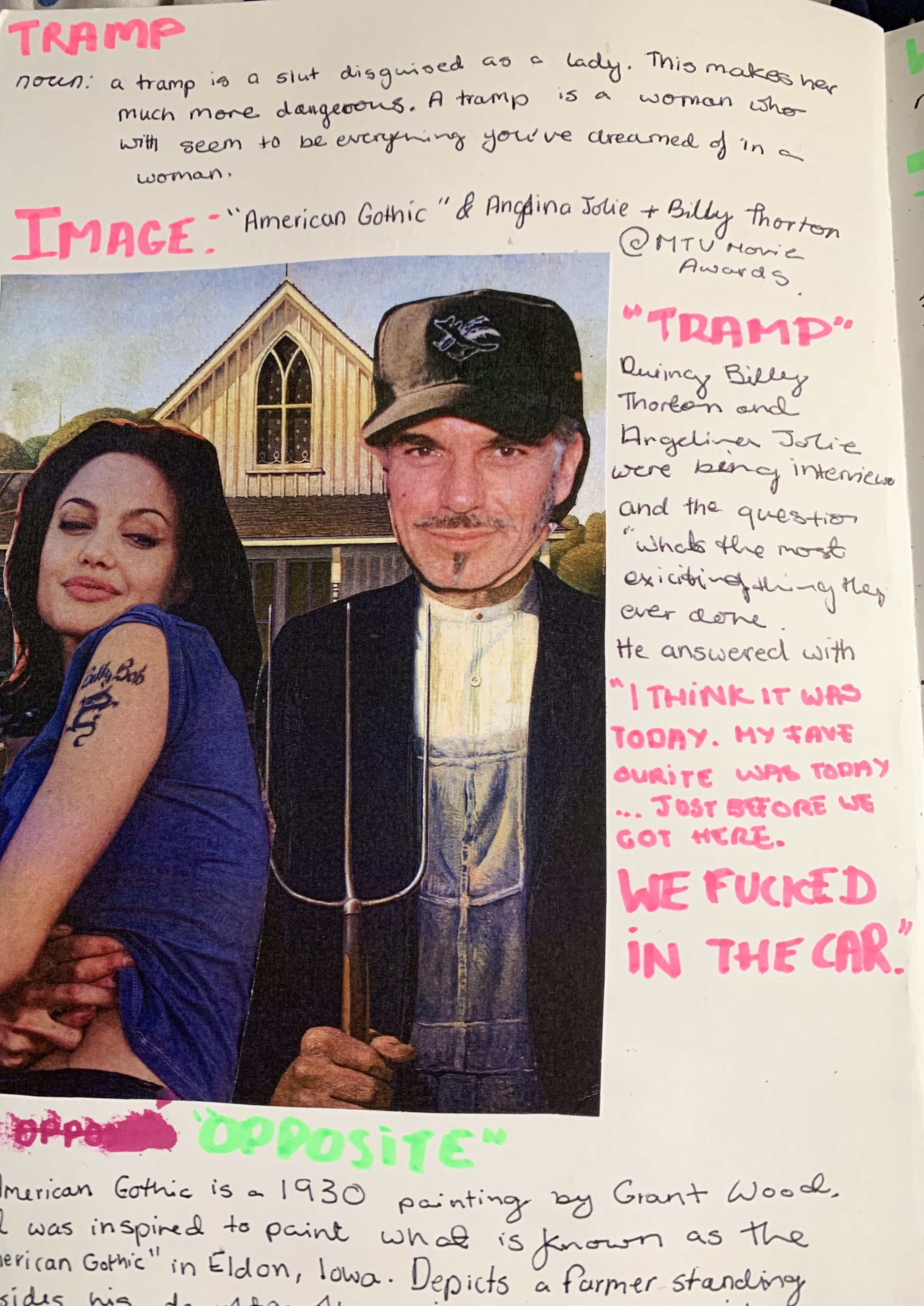
Angelina Jolie and Billy Thorton as “American Gothic”: The word I focused on for this was ‘TRAMP’. The meaning of the word is another version of a slut but instead of being visibly out there with her promiscuity, it’s more disguised. I chose Angelina Jolie because she’s portrayed as such a classy woman in the media and she has no wrongs. I wanted to subvert that image of her.

American Gothic: American Gothic is the 1930s painting by Grant Wood, Wood was inspired to paint it in Eldon, Iowa. The painting depicts a farmer standing beside his daughter often mistaken for his wife

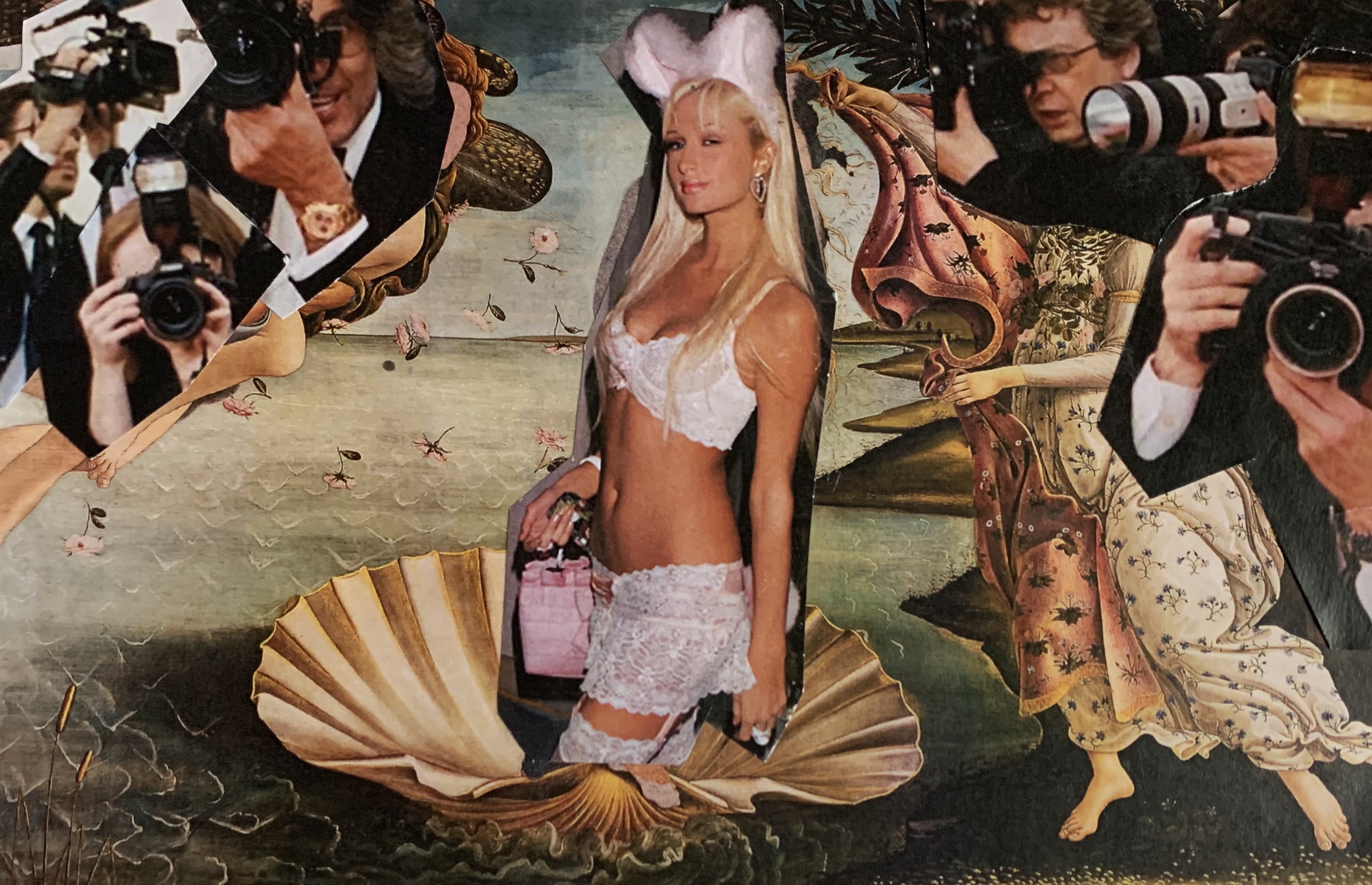
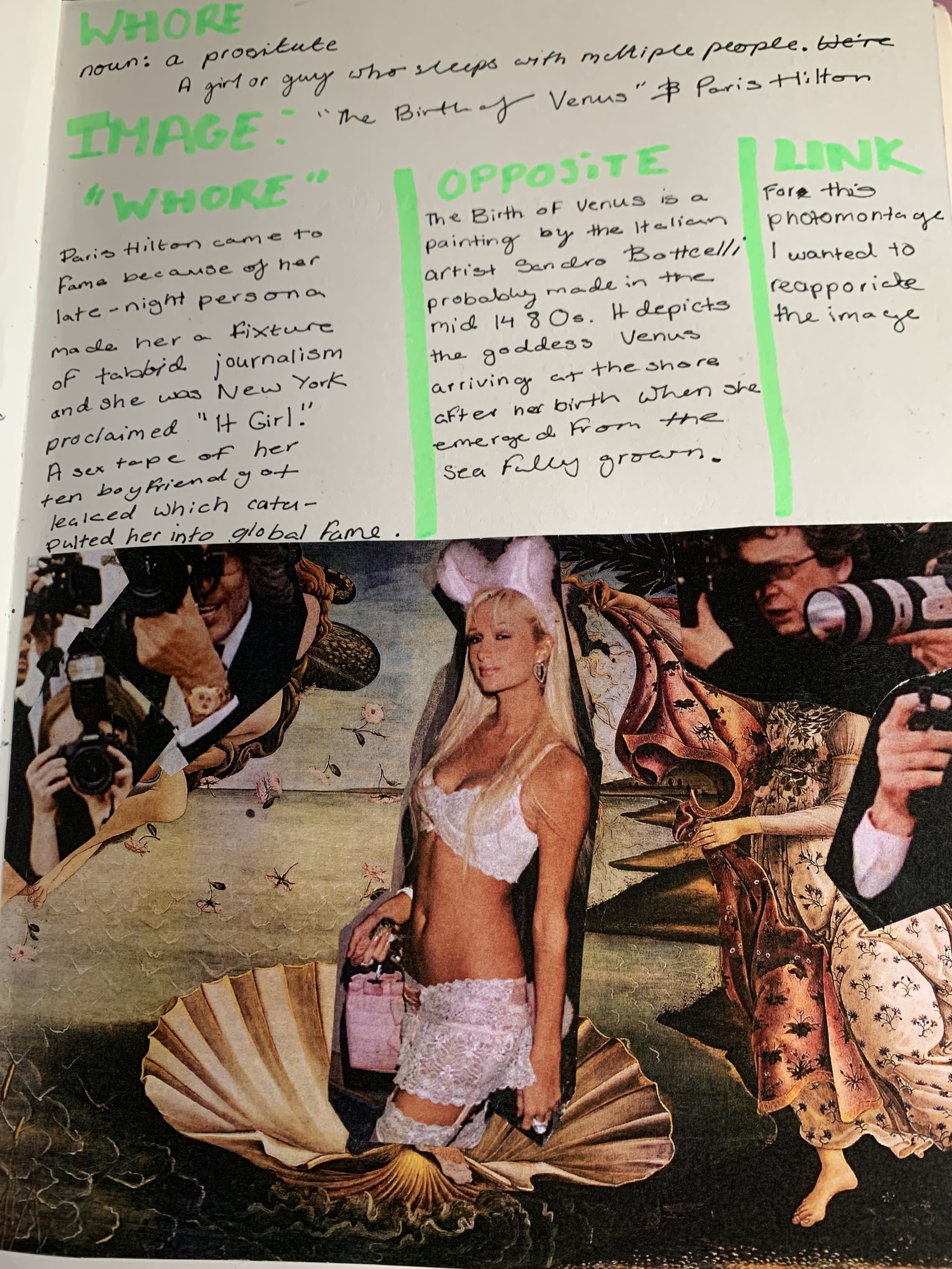
Paris Hilton as The Birth of Venus”: The word is was looking at for this piece was WHORE. A whore describes a person that has many sexual partners. During her peak, Paris Hilton came to fame due to her late-night persona. This made her a fixture of tabloids. Also, a sex tape of her and her boyfriend got leaked which projected her into global fame.

The Birth of Venus: The birth of Venus is a painting by the Italian artist Sandro Bottelli probably made around the 1480s. It depicts the goddess Venu arriving at the shore after her birth when she emerged from the sea as a fully grown woman.

Initial Influences:

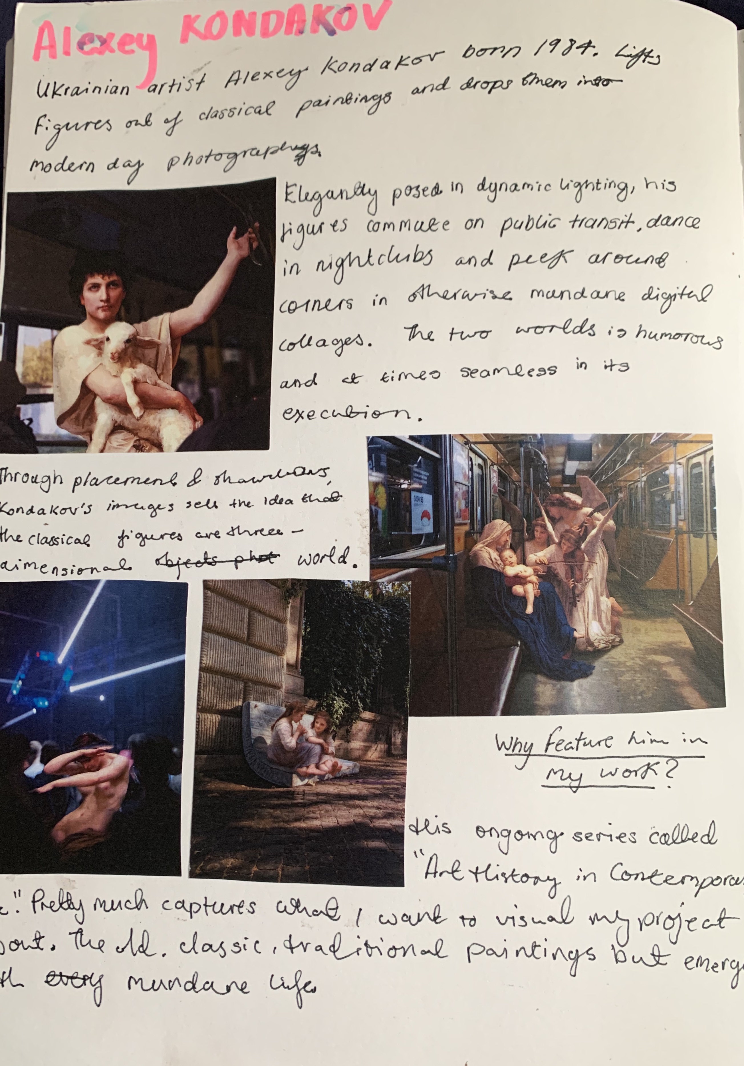
Alexa Kondakov was a visual influence because of his series called “Art History in Contemporary Life” pretty much captures what I wanted my visuals to have that contrast

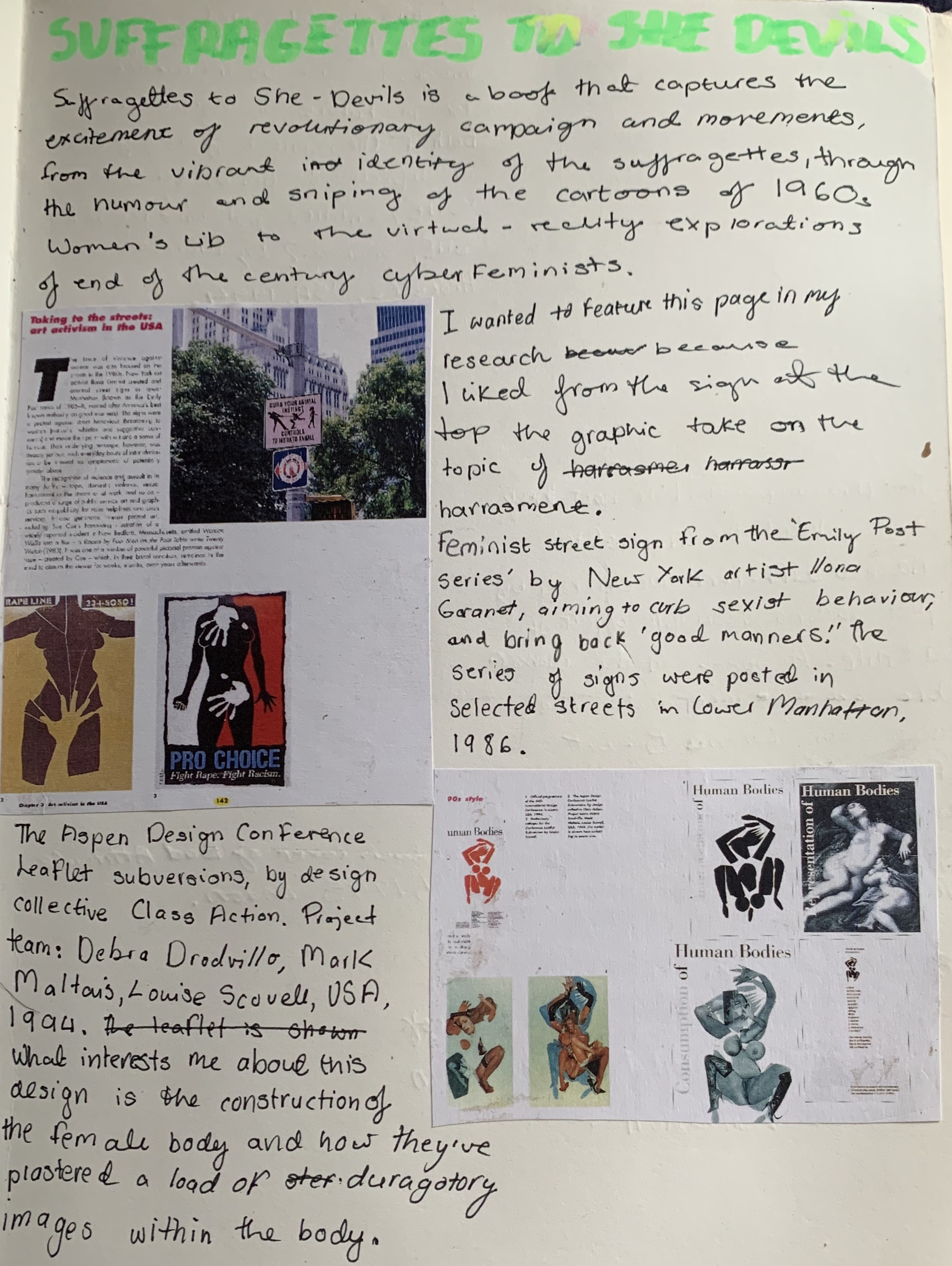
Suffragettes to She-Devil influence was for the themes and the ideas of seeing the evolution of women being seen as saviours to being little through sexualization.

Photomontages #2:

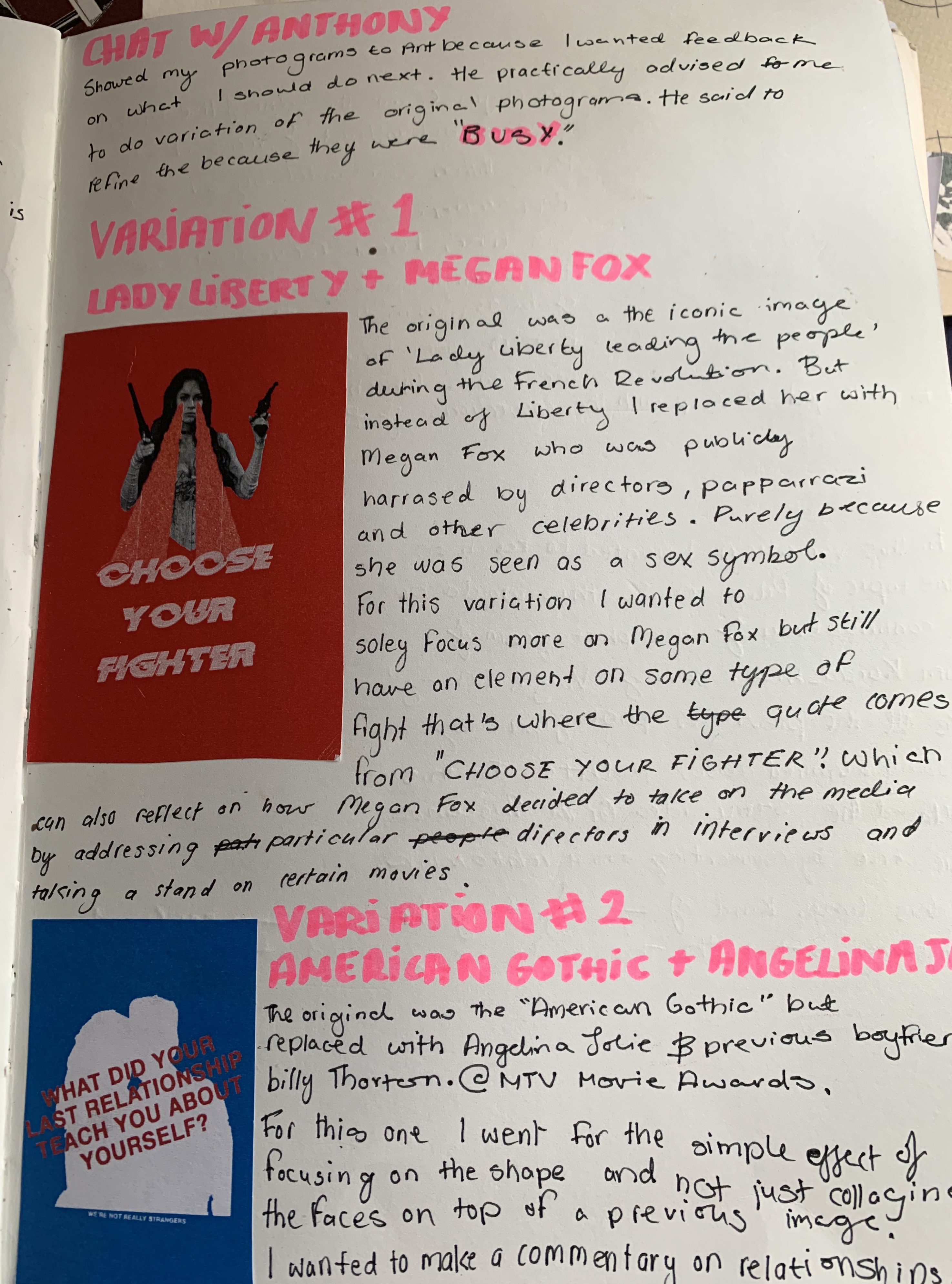
Theses photomontages are a result of having to refine the previous ones because they were too busy.

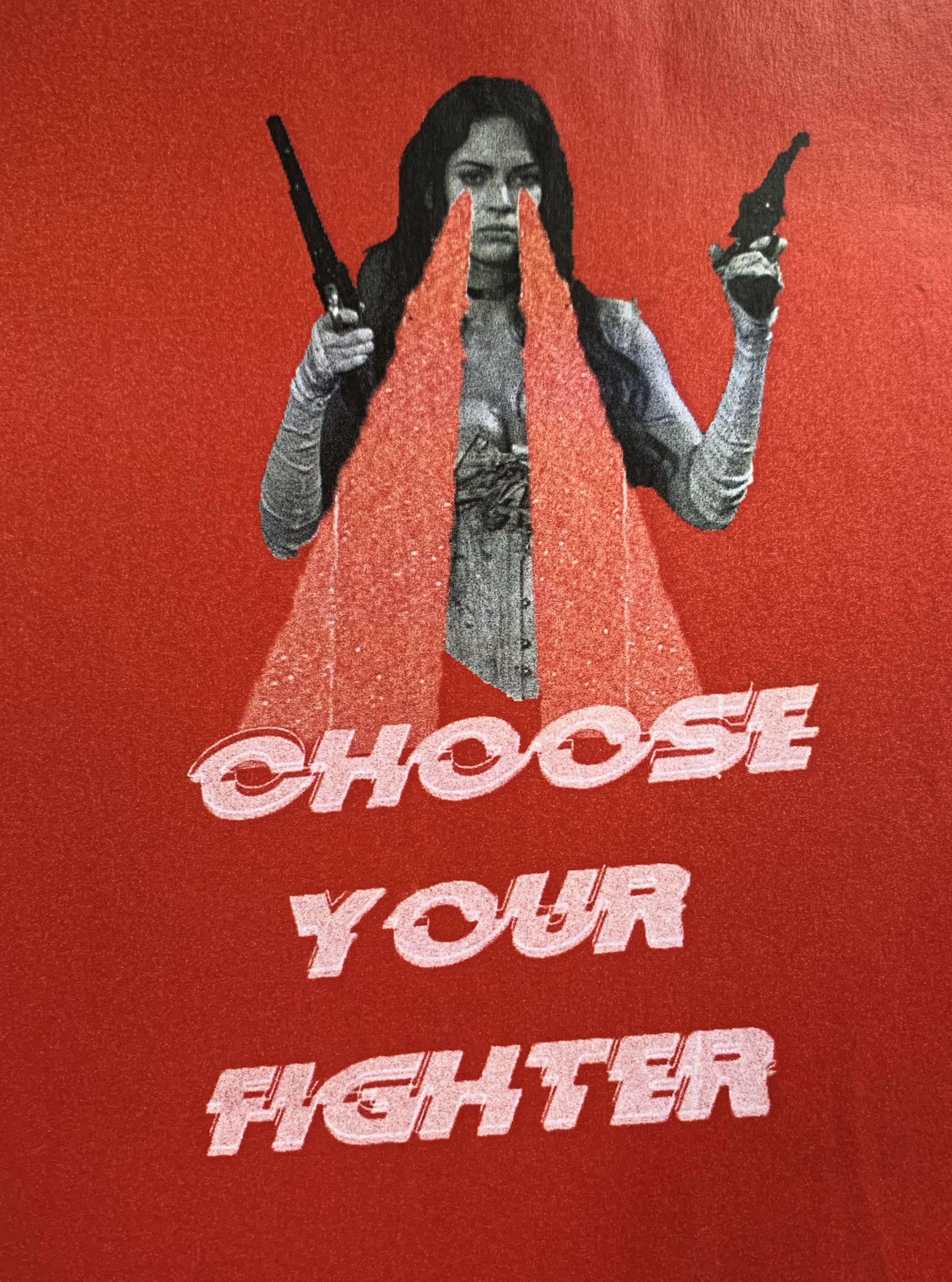
Variation One: I wanted to solely focus more on Megan Fox but still have an element some type of fight that’s where the quote comes into play. “CHOOSE YOUR FIGHTER”. Which can also reflect on how Megan Fox decided to take on the media by addressing particular directors in interviews.

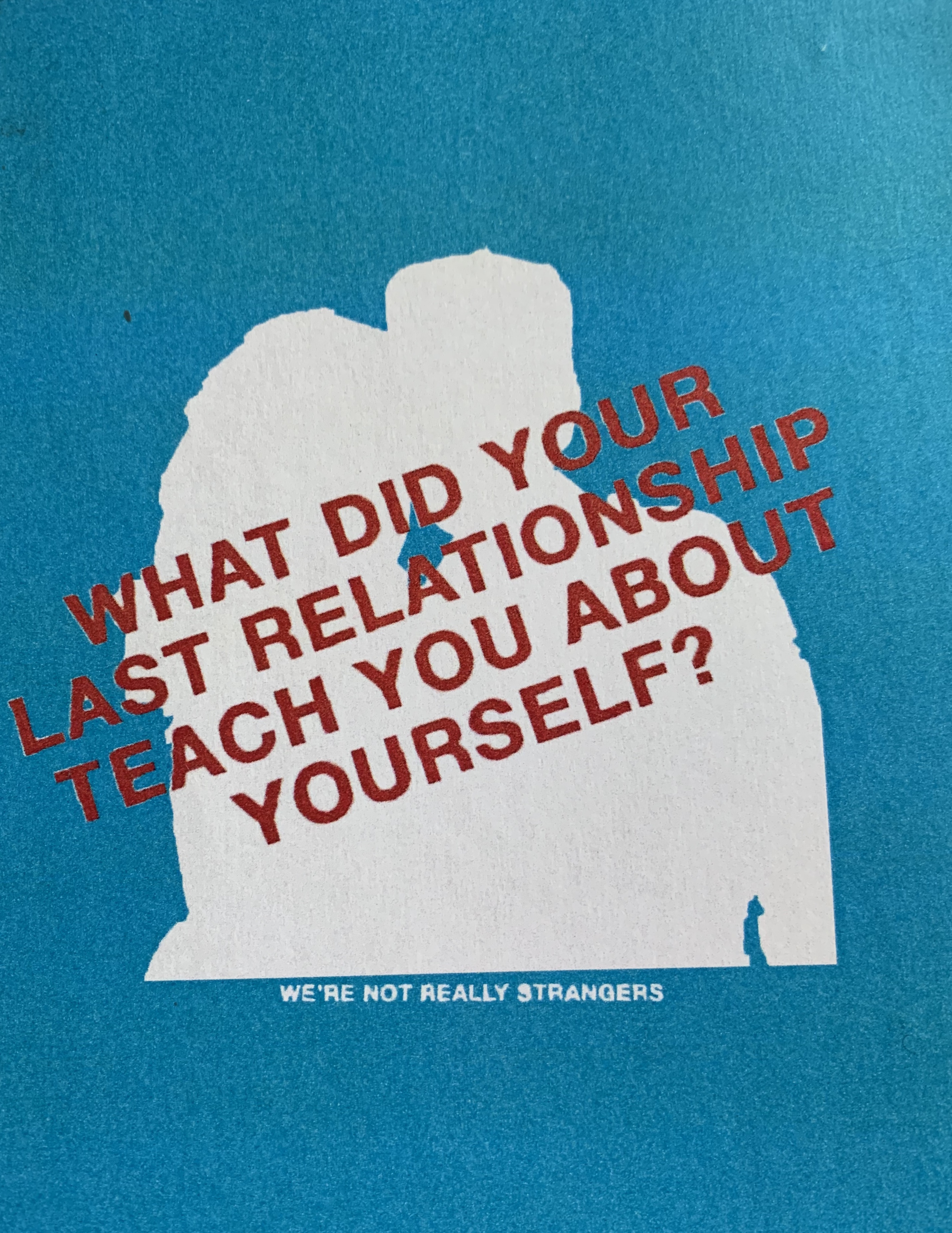
Variation Two: The original picture was Angelina Jolie as American Gothic. I went with a more simple approach. Focused more on the silhouette of there bodies instead of just collaging them on top of another image. I wanted to make a commentary on relationships with this piece.

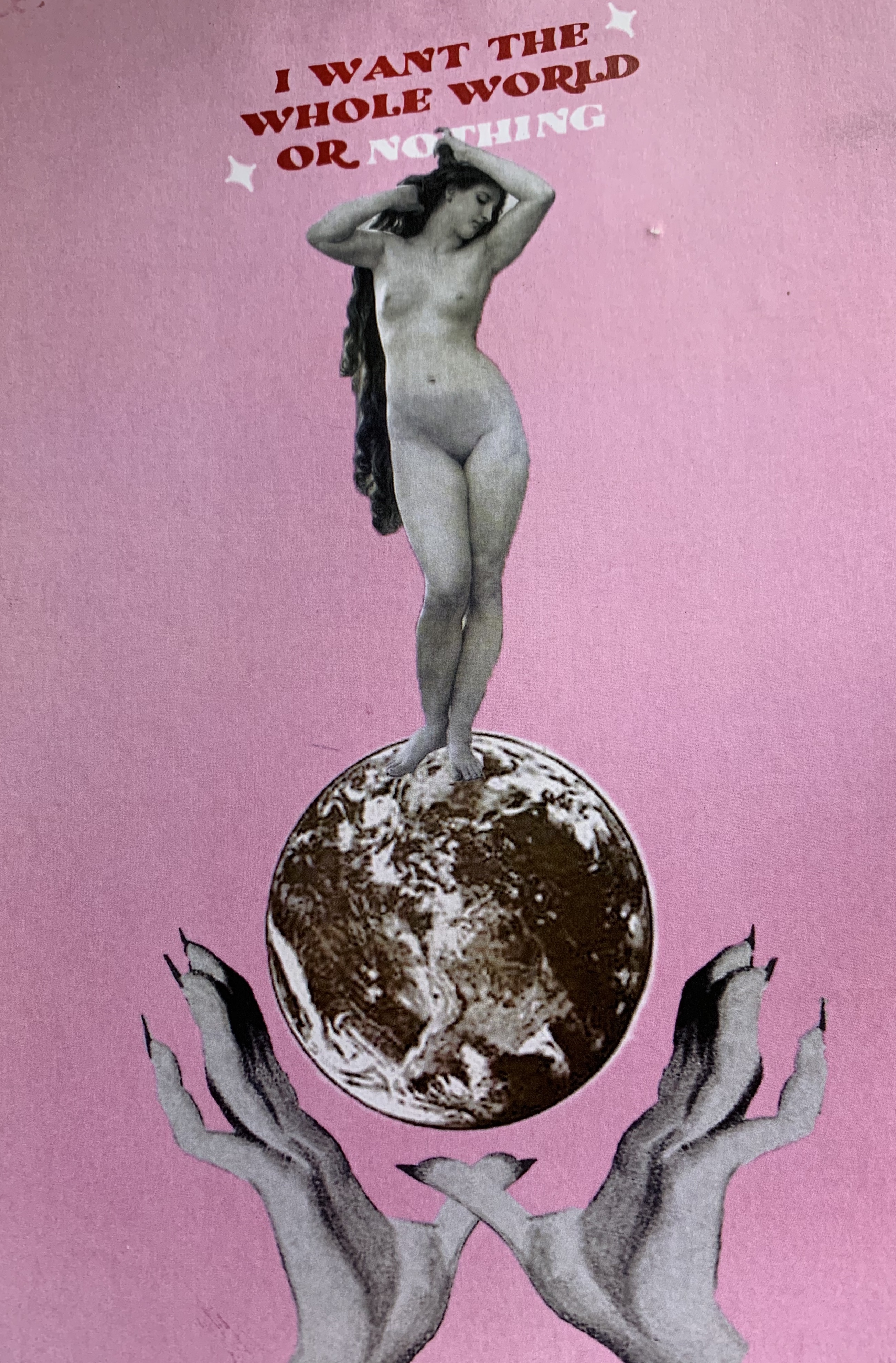
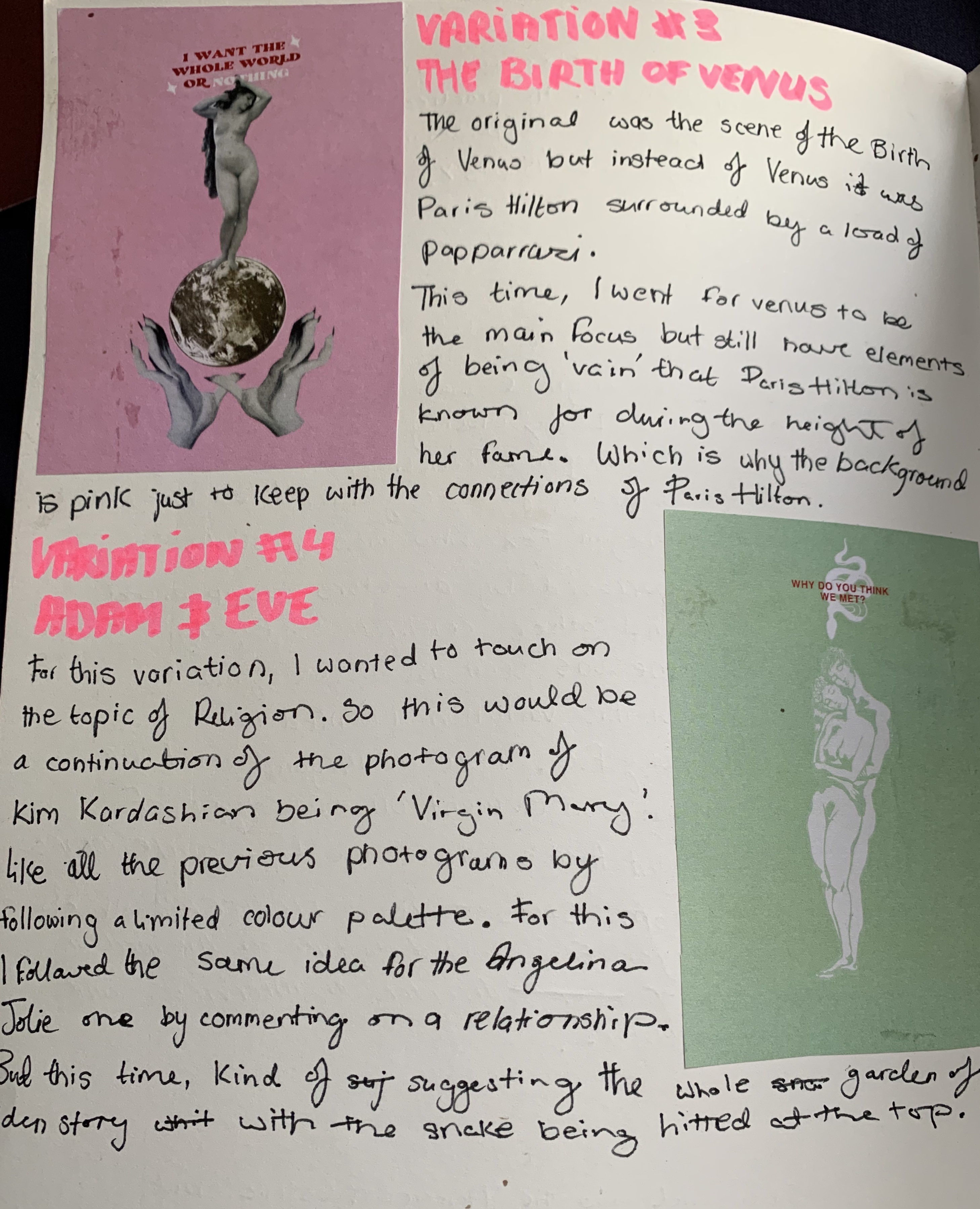
Variation Three: Instead, of Paris being the main focus of the piece I went for Venus. I wanted to still have the of ‘Paris Hilton’ look to it. That’s why the background pink so that links up. With the quote, “I WANT THE WHOLE WORLD OR NOTHING” I wanted to keep the same element of vanity that the first one had.

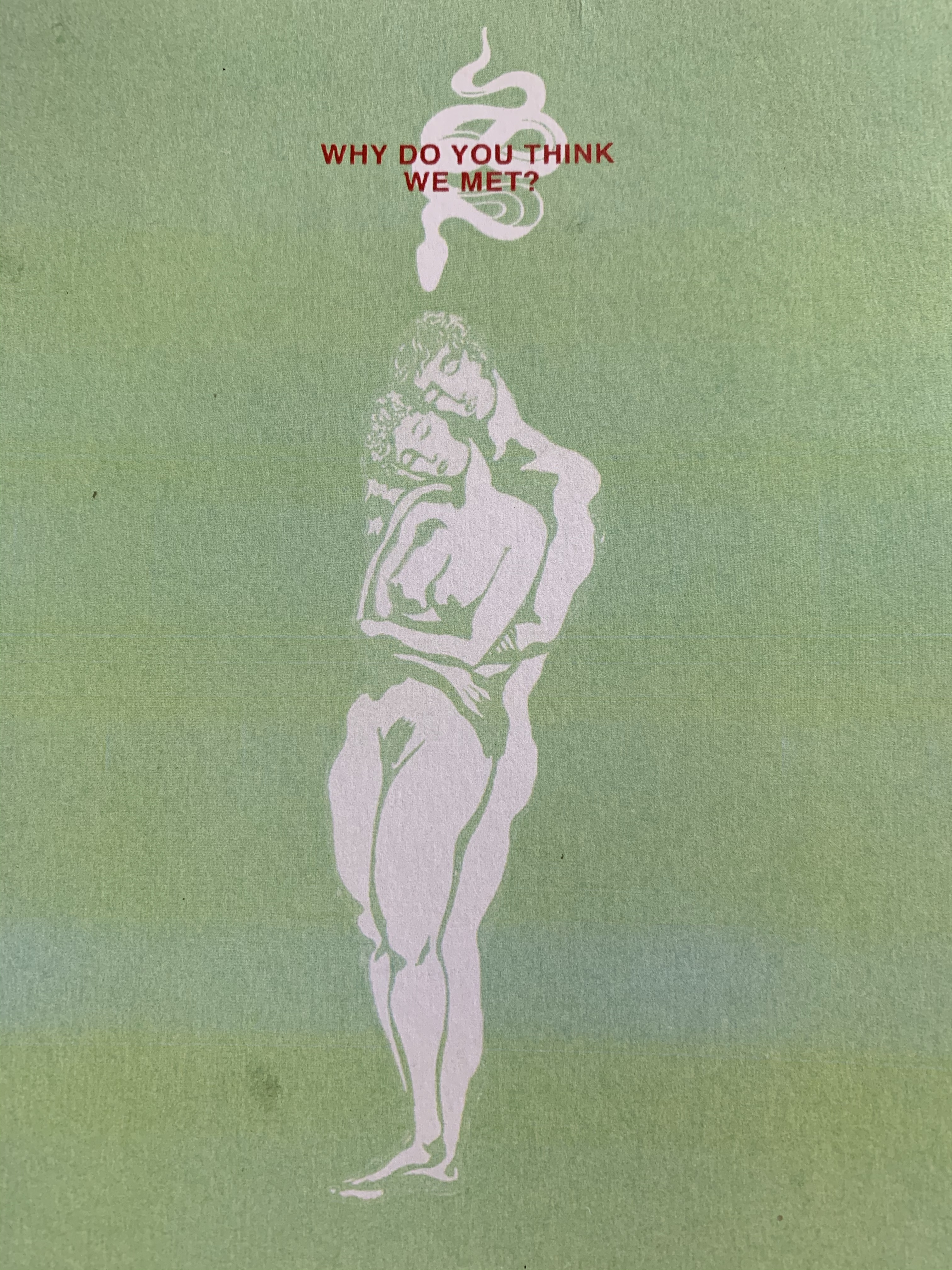
Variation Four: For this variation, I wanted to touch on the topic of religion. So this would be a continuation of the photograph of Kim Kardashian as the Virgin Mary. Like all the previous photographs this one follows a limited colour palette and I wanted to be vague on what I was referencing. Which is the story of how Adam & Eve met.

Further Influences:

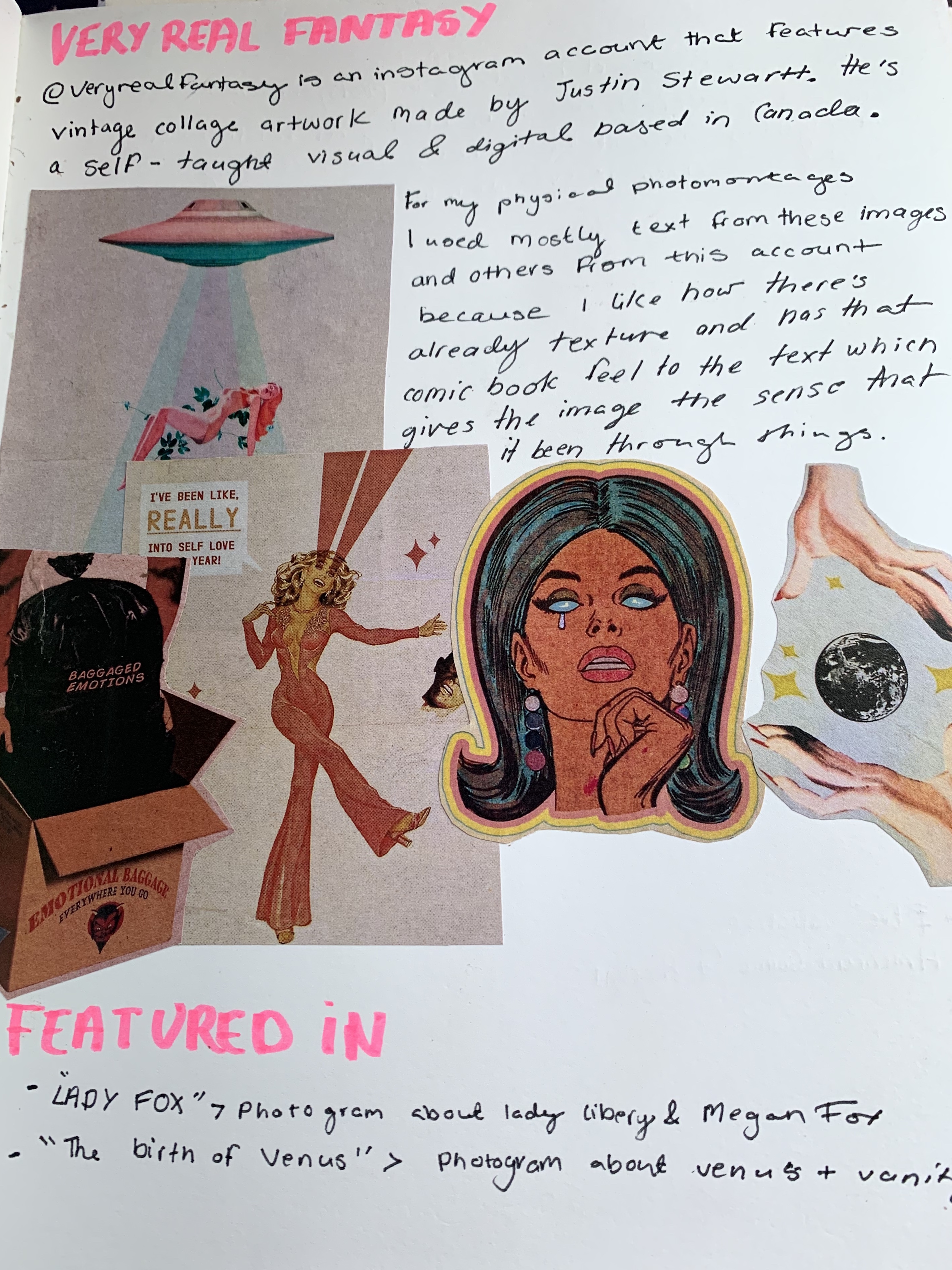
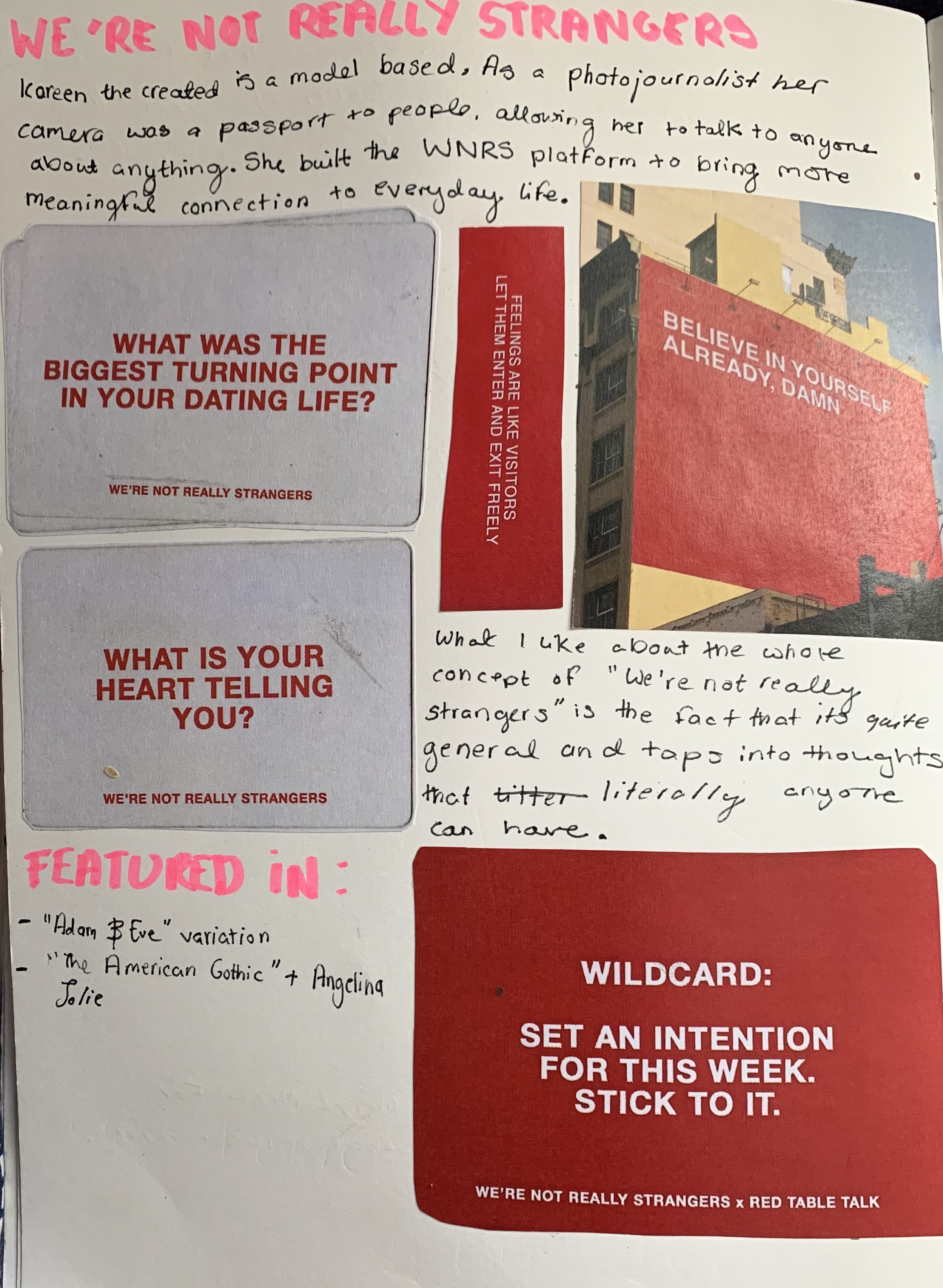
I used both of these accounts in my photomontages to add text and imagery just to create that difference.

@VERY REAL FANTASY: From this account, I used most was the text because I liked how textured it was and the text has this comic book feel that I wanted to have in my work.

@WERE NOT REALLY STRANGERS: What I wanted to incorporate in my work was the general topics being commented on.

Categories
Exhibition

Magazine Draft #1

45 Minutes

The topic of this piece is very personal to me and that why I chose to make a piece on it. The topic of racism & cultural appropriation make feel two main feelings which are confusion and anger. So the theme of this piece is the latter emotion. The reason for this topic to be so confusing to me is because of how theres different opinions what cultural appropriation actual is and what people can “take”. Obviously it has become more deluded because of celebrities overtime are making a norm to use influences from other cultures but claim they did it first.

The piece is a reference to when a undergraduate for her final show decided to make the models wear an over exaggerated version of blackface and one of the black models refused to wear the pieces and recalled one of the members of staff telling her “It was fine to fell uncomfortable for 45 minutes. So decided to make the models the main vocal point and have the text surrounding them. I wanted to be clear you get what I’m staying instantly with this piece.

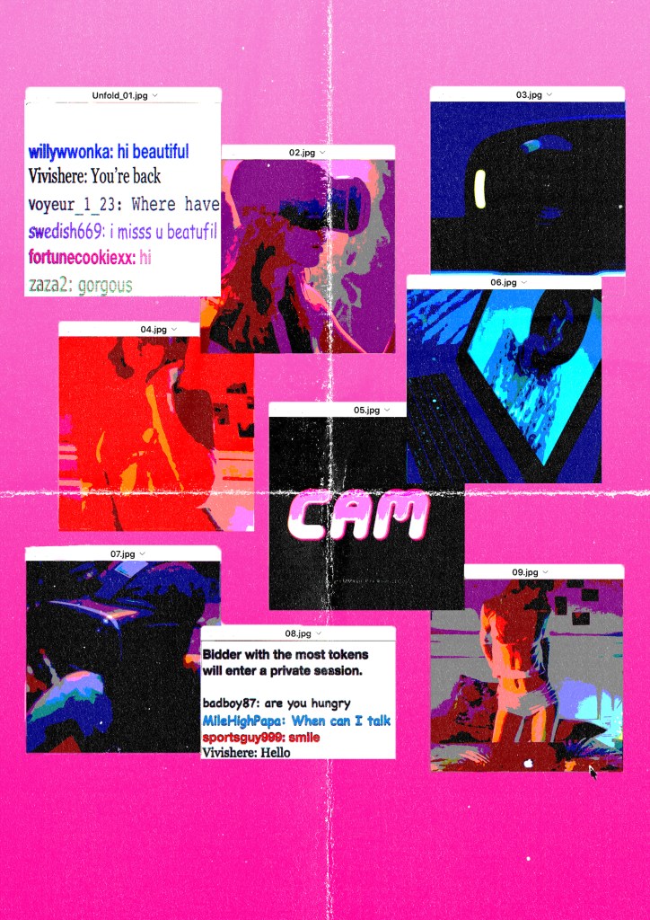
Cam Girl

For this project, most of my pieces have no connection with my essay and I wanted to somehow bring my essay topic back into my physical work.

How I came across this topic was that Becky put a link to this website that shows a range of videos in different genres. I went on and searched, social media and the internet and came across this series called Dark Web that looked at different aspects of the internet in a more gritty, realistic way. One of the videos in that series was a bout cam girls and the unknown fear of not knowing who’s watching them. I used a layout, that replicates a pop ads and I replaced them with images from the series.

Disconnect

Following the themes of Cam Girl, this piece is a commentary on how people are so connected but most people look at it, that people today are more distant than ever. With the globe icon it’s the most recognisable image that link with connection or old school internet logo.

Currently Working on:

Categories
In Real Life

Experiments

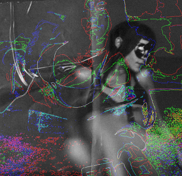
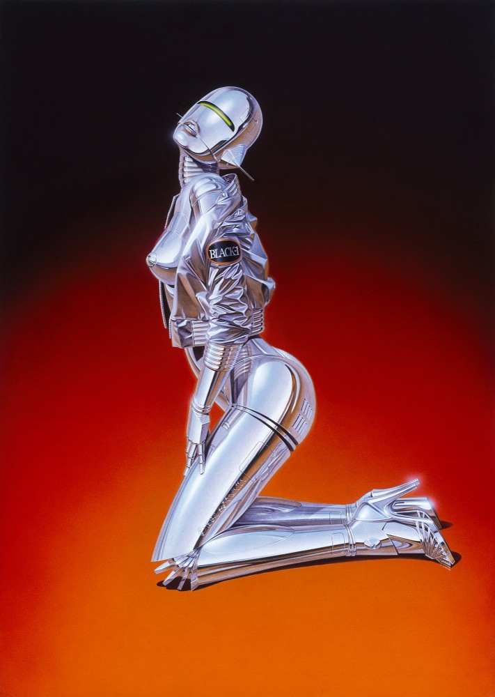
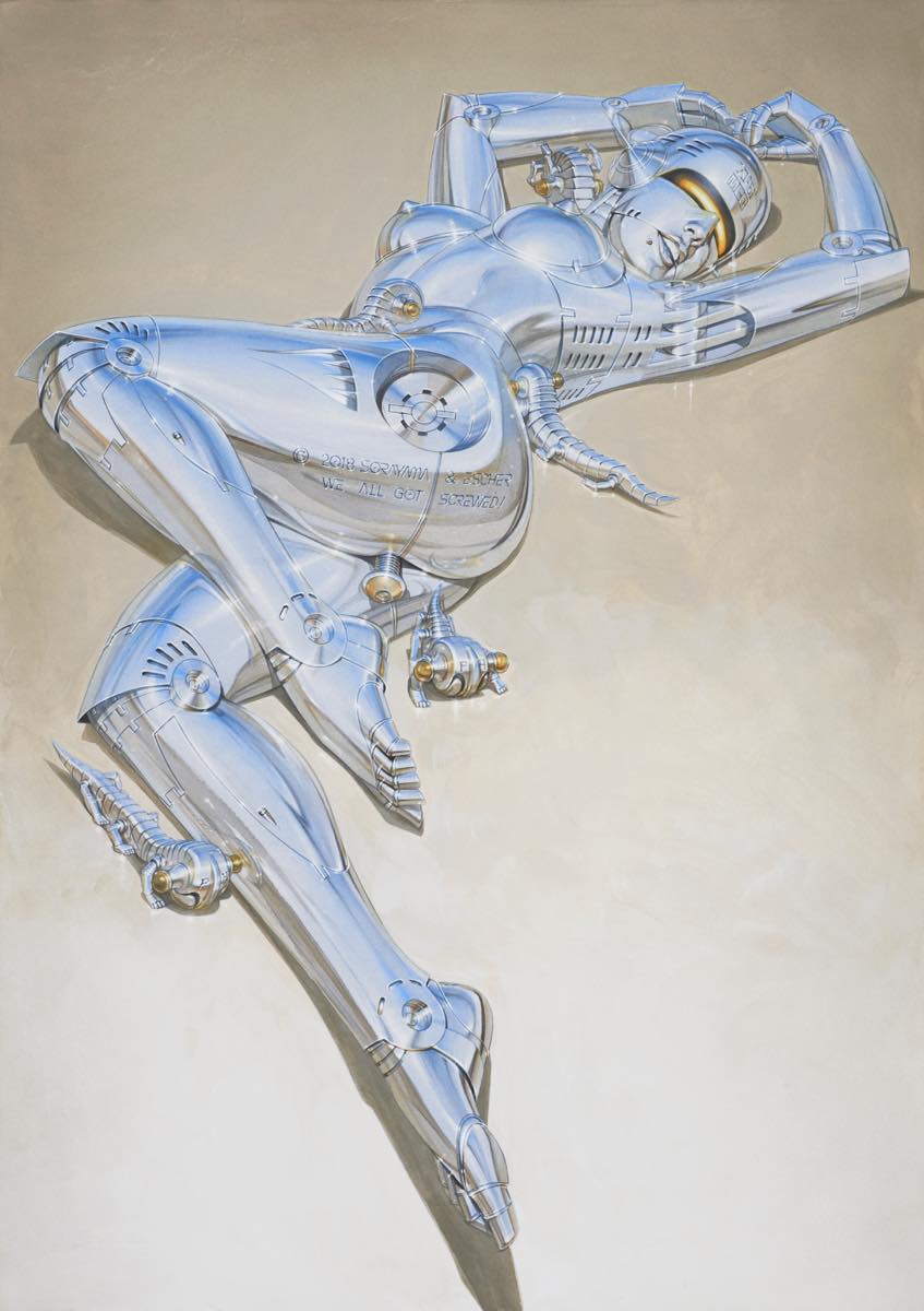
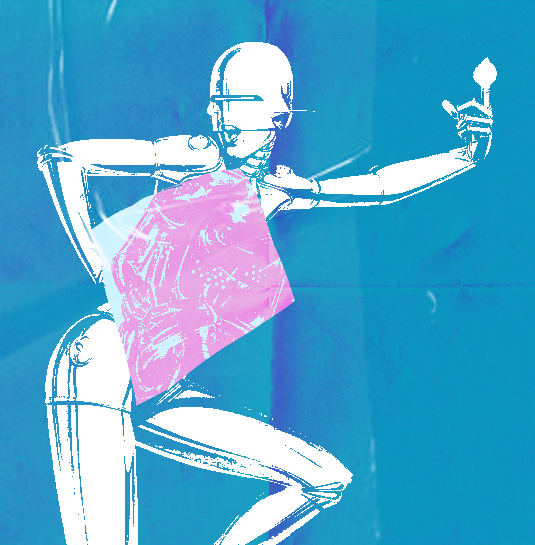
After looking at Hajime Sorayama, I wanted to play around with his style and try to make sense of what direction I want my project to go in next.

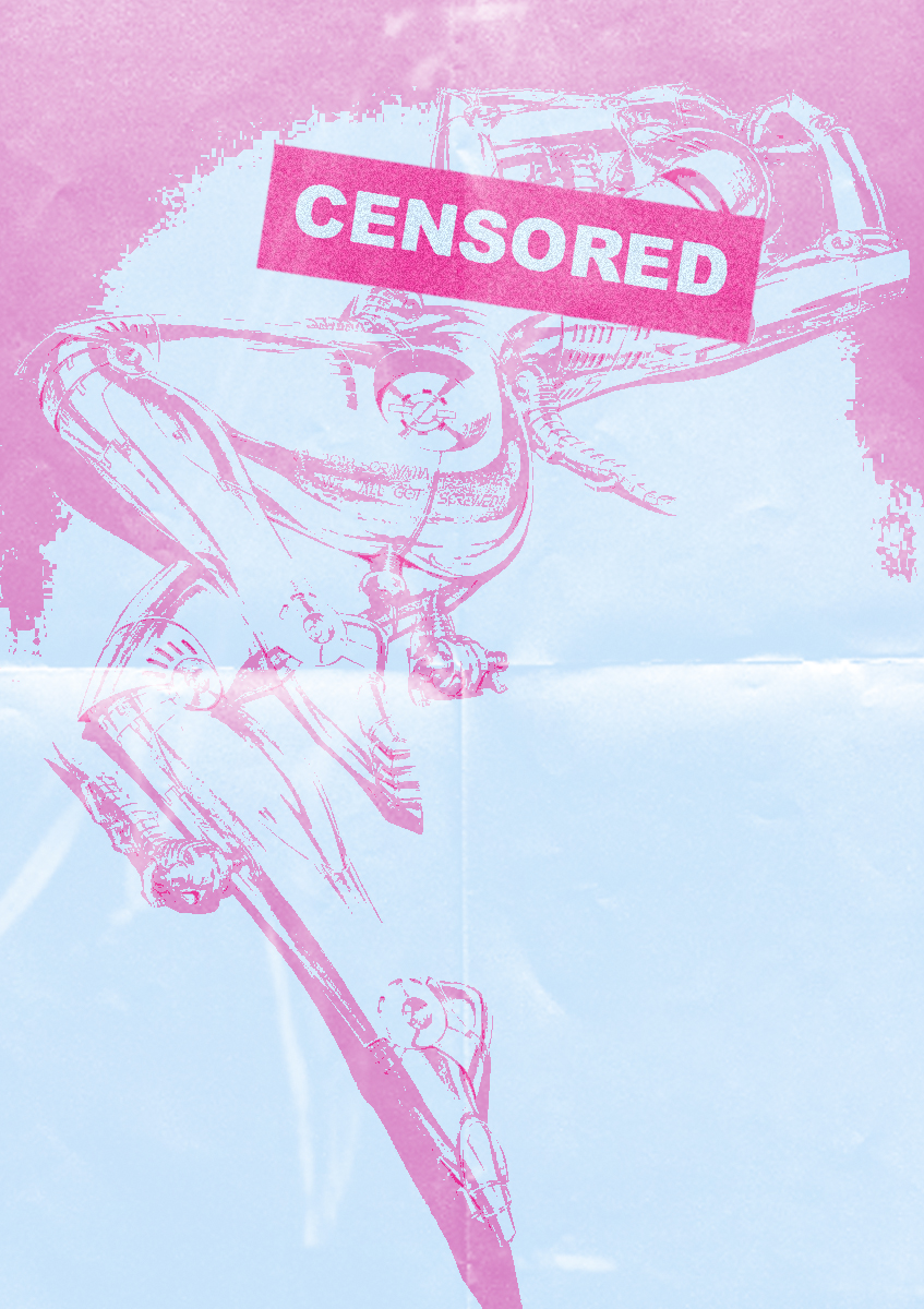
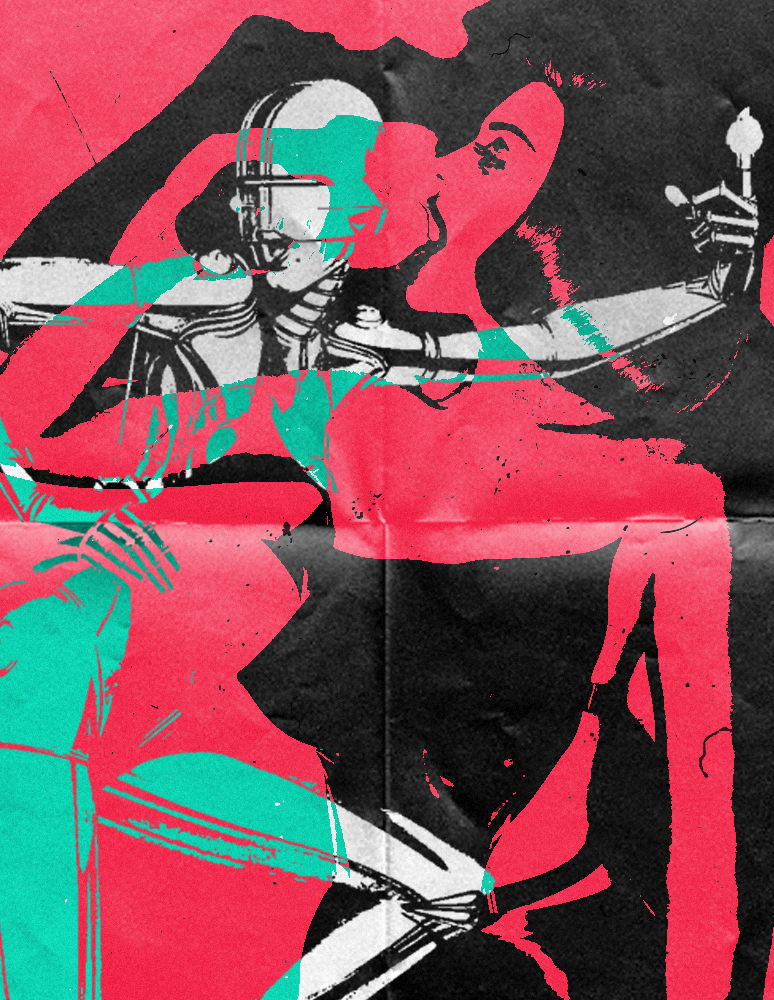
Going off from the two Hajime pieces above I wanted to follow the same look that he does. Most of his work are provocative and out there but without making it look trashy. The text isn’t really major part of the image I wanted to feature it because with the effect on it I like how it go with the overall piece and the colour palette.

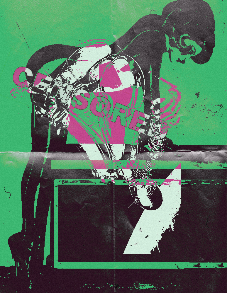
From the first piece, I wanted to explore the more graphic effect so these two pieces were a result of that.

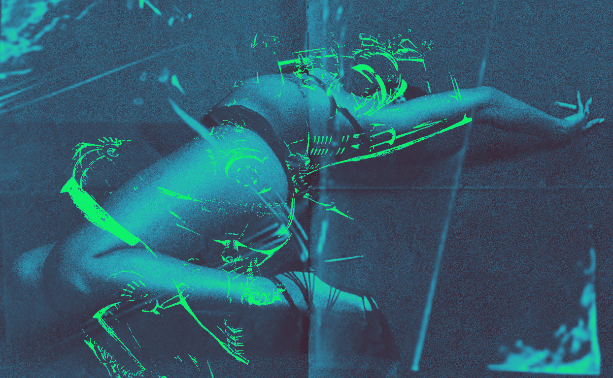
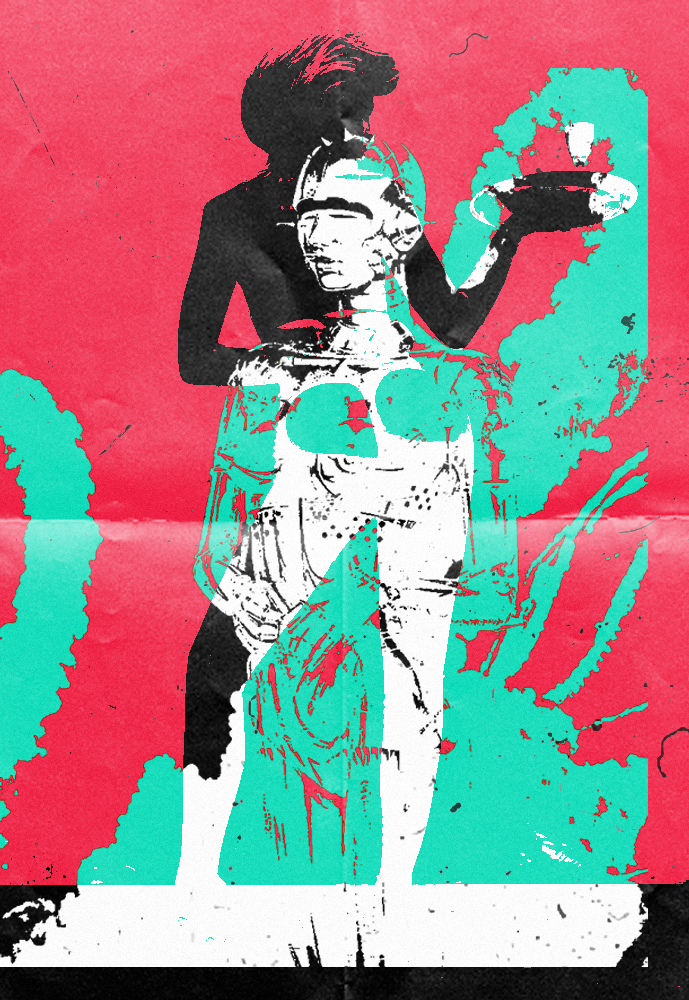
With this piece, I was going to continue using the same effect like I did for the previous ones. For the background image I went with the theme which is more “bdsm” look to the photo. The reason why I went for these types of images were that they were easy to contrast with, looks more simple in my opinion.

Categories
In Real Life

Hajime Sorayama

Hajime Sorayama is a Japanese illustrator known for his his precisely detailed, erotic portrayals of feminine robots. Sorayama’s designs are a blend of fine art, illustration, and industrial design, developing his unique style of ‘superrealism’. He has collaborated with brands such as Medicom Toy, X-LARGE, and British Knights.

Dior X Hajime Sorayama:

Dior Men’s creative director, Kim Jones, saw an exhibition by Japanese artist Hajime Sorayama at Tokyo’s Nanzuka gallery. Kim Jones inspired by Sorayama’s meditations on the limitations of desire, which the artist explores through his hyperreal, erotic fembot sculptures, crafted from silver Mylar—felt the artist would be the perfect collaborator on a collection dedicated to Japan’s innovative advancements in AI and robotics. 

“I describe my collaboration with Kim as two weirdos having fun,” says Sorayama, a prominent contemporary talent in his home country. “Kim has great artistic vision. As a creative myself, I could see this from the beginning.”

What I’m taking from Hajime Sorayama:

In the sense of where i’m going with this project, I wanted to feature this artist cause of his look at the female body because a certain aspect of my project that focuses on the two sides of body image. The more over exaggerated body that lives in digital world vs the every day bodies that are seen everyday.

Categories
In Real Life

Moving Forward:

For my project to go into the next stage, I would have to take a back seat on how the visual side of the project was going and focus on the concept and topics that my work are going to talk about. Anthony suggested instead of just vaguely looking at women’s right that I make it more specific. Looking at different subjects within. For example: body image, menstrual cycle and more serious case topics like rape.

The Perfect Body

So, I ran with the idea of body image and how there this idea that there’s this “perfect body”. I went for this imagery, most model are called hangers thats essential their job to make the clothes look good. Instead of putting the same body type I went for three types of body types that are contrasting. The middle body would be seen as the body to have today whilst the other two opposite from the middle one.

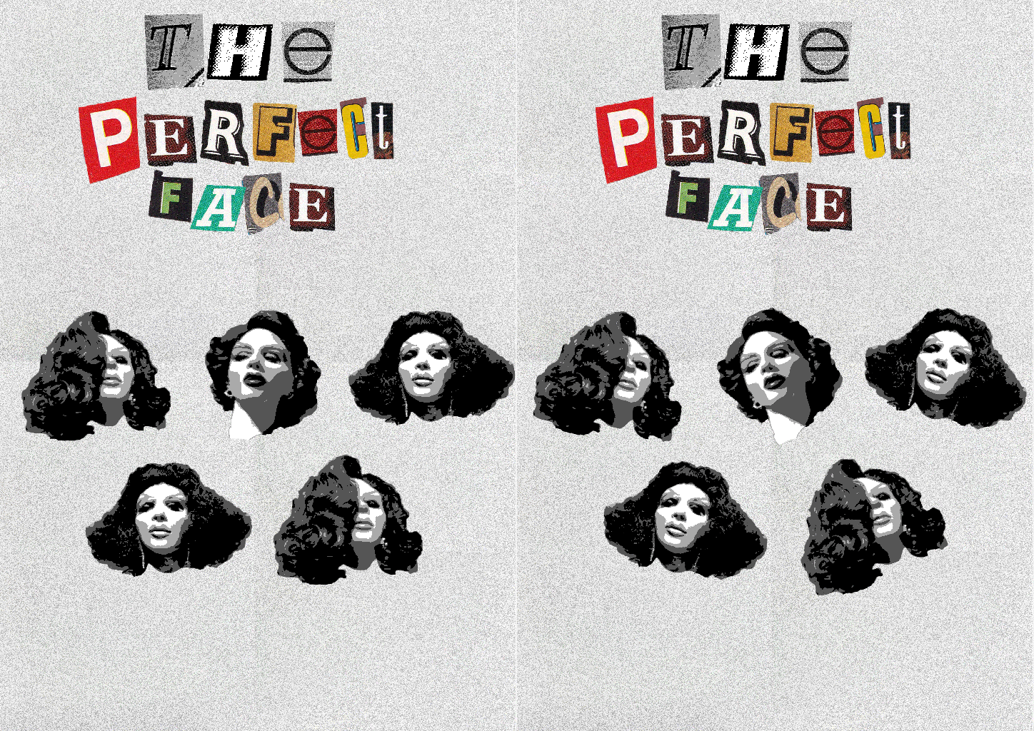
The Perfect Face

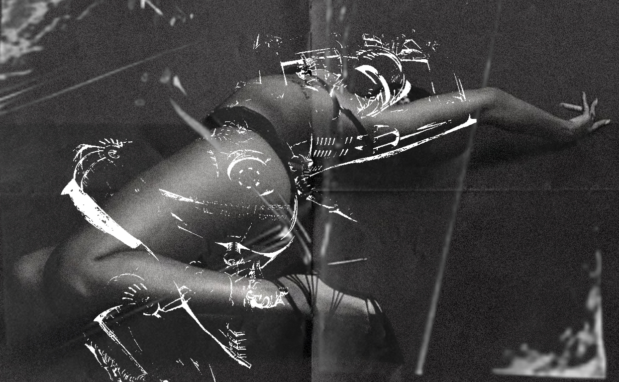
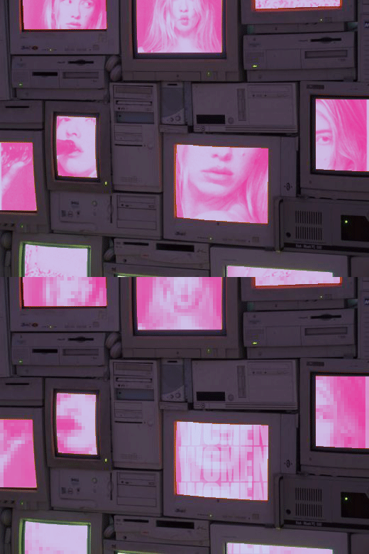
Following with the same idea of body image. I went on to make a gif. The original idea for this gif was to comment on plastic surgery but overall I don’t think that the message came across.

PERIOD.

Moving away from the topic of body image, I wanted to make a piece about menstrual cycle. So I went with an obvious imagery, its really simple. Would probably make a variation of this.

Broken Face

For this piece the main idea was that I wanted to enlarge certain bits of a persons face. Don’t know what how it could relate with body image but I needed to get down just to get a visual. Also wanted the piece to have texture to, so I added a load of overlays of cello tape and crumpled paper.

Categories
In Real Life

Keiichi Matsuda

Keiichi Matsuda is a London based artist who is a designer and film-maker. Matsuda mixes Japanese and British origins. His work has been widely exhibited, from London’s V&A Museum to New York’s MoMA, as well as attaining viral success online.

Keiichi Matsuda: Hyper Art

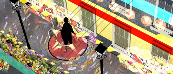
Keiichi Matsuda directed the video installation called “Hyper-Reality”. It shows the blend between augmented reality and actual reality. Matsuda explores connected environments also using interactive installations, where he reprocesses and makes visible the information that permeate the city every day, which is not perceivable separately through our devices. 

What would I incorporate from Keiichi Matsuda’s work into mine?

From his work, I would incorporate the idea of augmented reality blending into actual reality. Visually speaking, I find his concept drawing for his installations interesting as its kind of a window into his thought process.

Categories
In Real Life

Gifs with an agenda

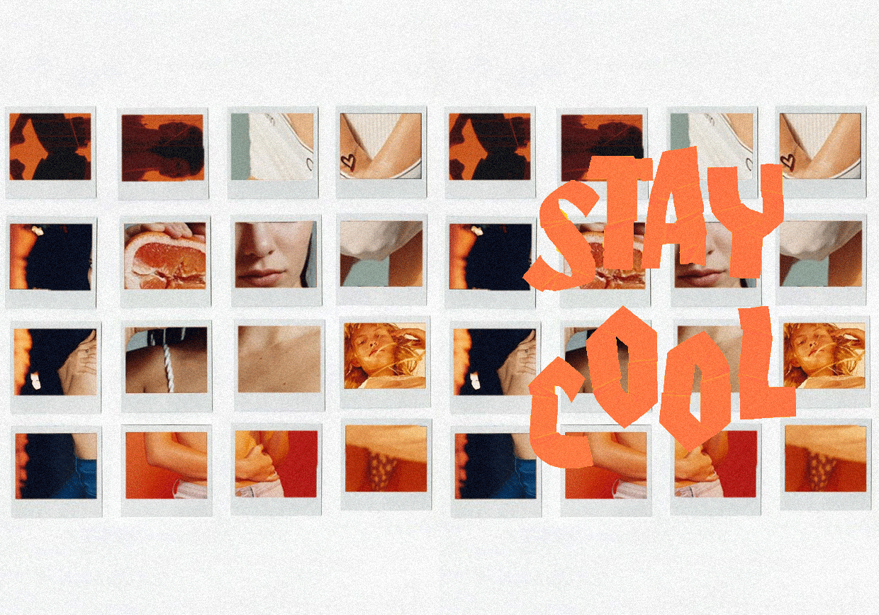
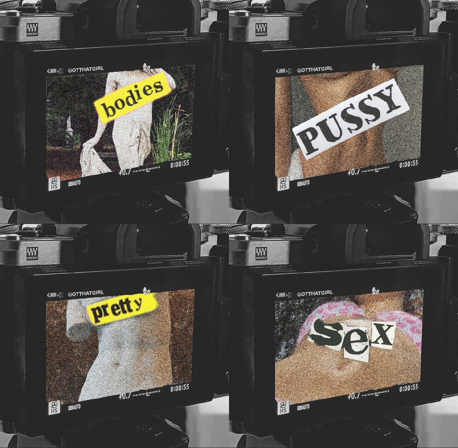
This is a continuation of the type of format I wished to use but instead of it being random images without meaning. This time I’m going to find a way to comment about topics that find interest in. The goal here is to incorporate text and imagery.

For my first gif, I had the instant idea to go back and look at previous idea for survival. My initial ideas for “Survival” were to look at female rage. I decided to revisit this topic with images from Halsey’s Nightmare music video. Which literally a massive ‘Fuck You’ to the patriarchy.

The initial idea for this one was to look at objectifying the female body but not like in a disgusting way. But I don’t think that executed right and I tried to add text but its look more as an after thought than something that was supposed to be there.

Still had the idea of looking at the figure, instead of using tv screens for the background. I used polaroids instead because I came across this photoshoot for Calvin Klein. The colour palette for this shot its a lot warmer than the previous. Went onto decided that the images on the polaroids were not going to be moving this time only the text.

This one has a clear message behind. Women’s rights: through history. Wanted to continue on using different backgrounds, resulting in a film. Went for text that was kind of obvious to the image just to ‘hit the nail on the head’ even more.

This gif is like a variation on the second gif. I definitely had more of an idea of what imagery I wanted to have and the text that would be alongside it. Like the women’s right gif I wanted to be ‘now vs then’ type of look to it. So I chose greek statues of women and women of now. Using text from ‘Sex Pistols’ to plaster over these women’s bodies.
Categories
In Real Life

Nam June Paik

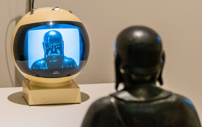
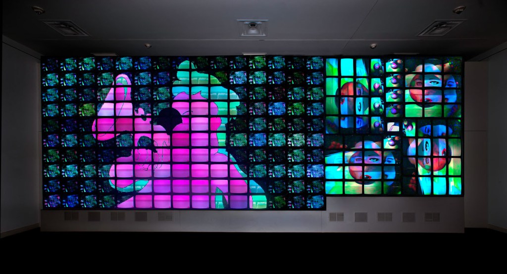
Nam June Paik pioneered the use of video with the topic of the internet. The artist Nam June Paik was born in Seoul, Korea on 20 July 1932. Nam June Paik work has always commented on the curiosity of the future of technology and the internet.

Nam June Paik’s work varies from genre, sculptures, performances, music and live broadcasting. His art reflects a fascination with philosophies and traditions of both Eastern and Western cultures.

TV Garden:

TV Garden 1974 – 77, Paik imagined a future landscape where technology is an integral part of the natural world. Placing TV sets alongside live plants, he creates an environment in which the seemingly distinct realms of electronics and nature coexist.

His approach follows the Buddhist belief that all things are interdependent and closely connected. It also suggests that technology is not conflict with nature but an extension of the human realm

The TV sets display Paik’s Global Groove 1973. This colourful, fast paced video mixes high and popular cultures, with imagery from traditional and contemporary, Western and non-Western sources. It captures the disparate and sometimes overwhelming content of contemporary mass media.

What aspects of his work would I incorporate in my work?

Nam June Paik’s ideology is the main influence to my topic and concepts. I would like to take how he blends the two states of nature and technology and combines them, to make an interesting thing. Sometimes his work is literal but I like how subtle the visuals are.

Design a site like this with WordPress.com
Get started