After looking at Hajime Sorayama, I wanted to play around with his style and try to make sense of what direction I want my project to go in next.
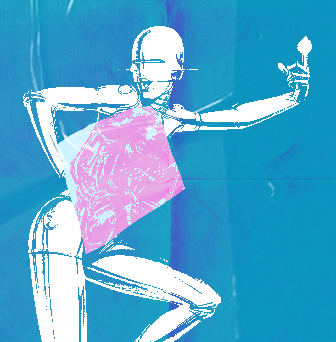
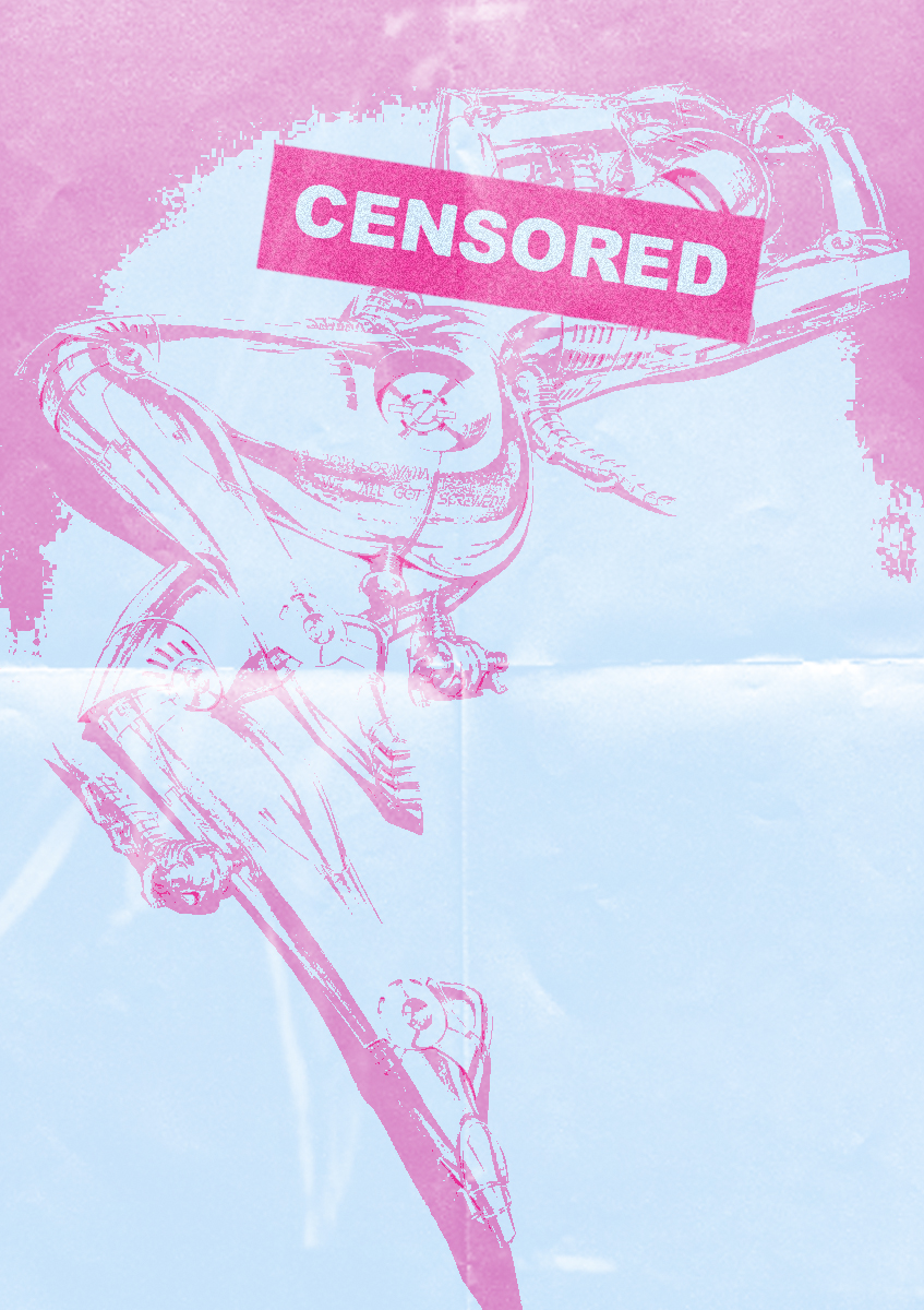
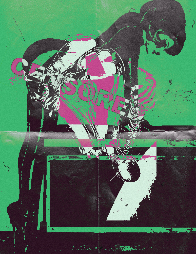
Going off from the two Hajime pieces above I wanted to follow the same look that he does. Most of his work are provocative and out there but without making it look trashy. The text isn’t really major part of the image I wanted to feature it because with the effect on it I like how it go with the overall piece and the colour palette.
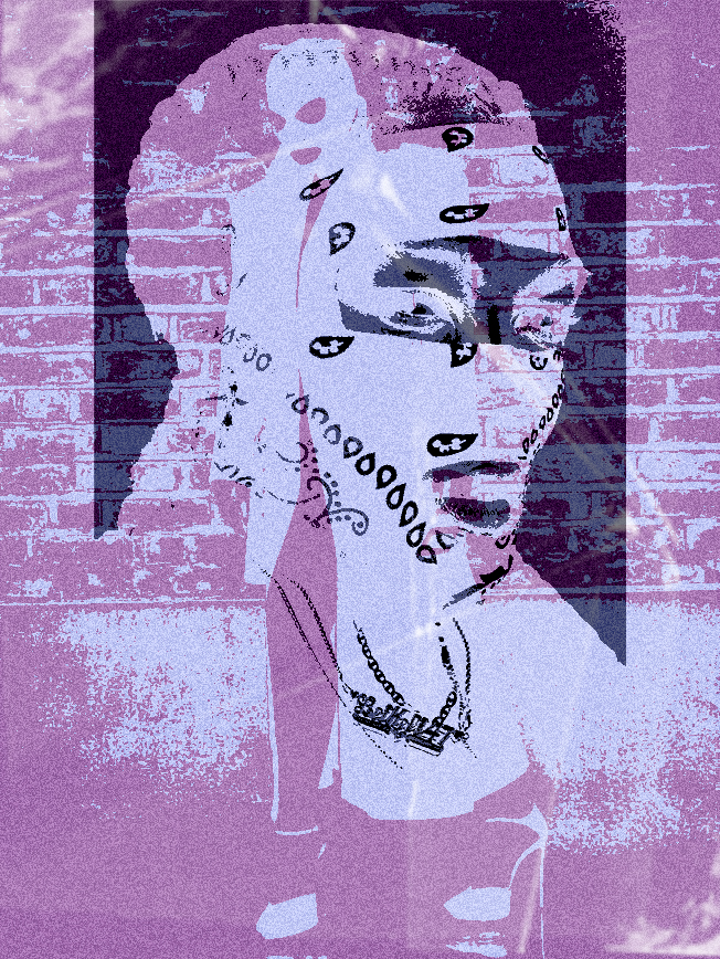
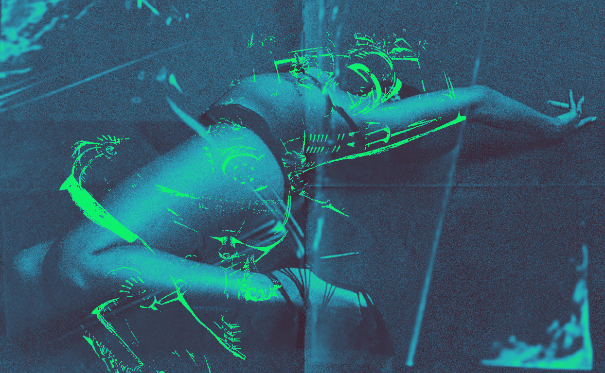
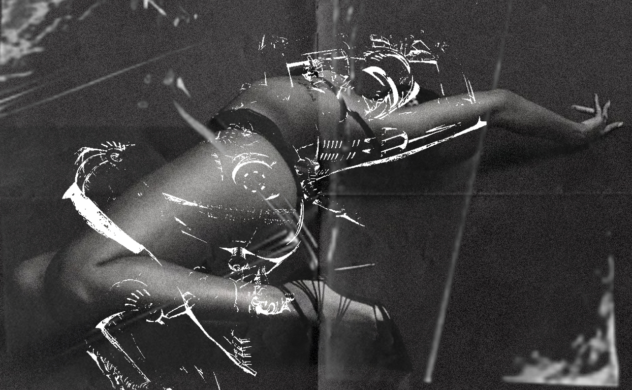
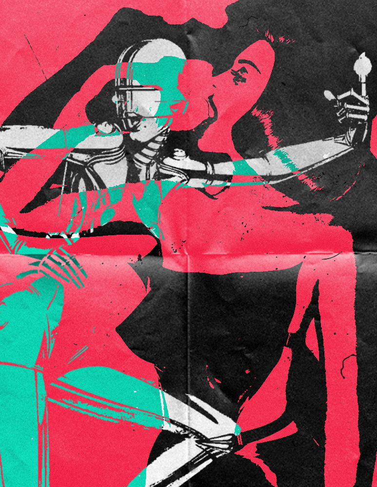
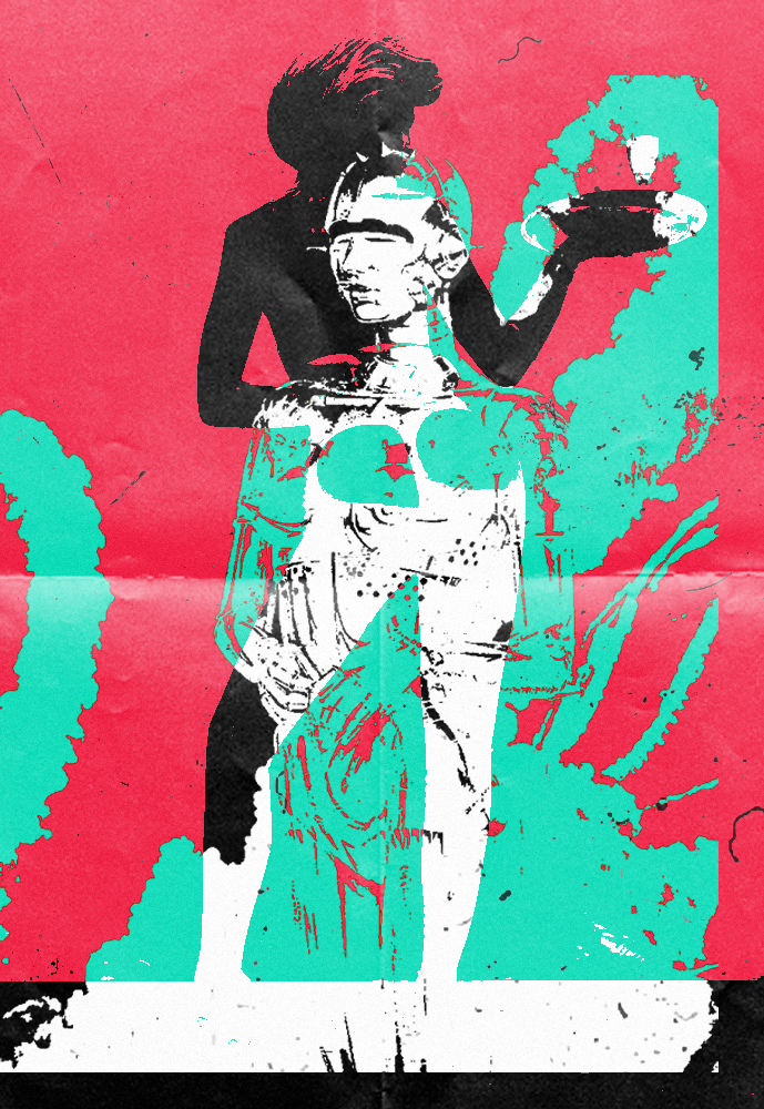
From the first piece, I wanted to explore the more graphic effect so these two pieces were a result of that.
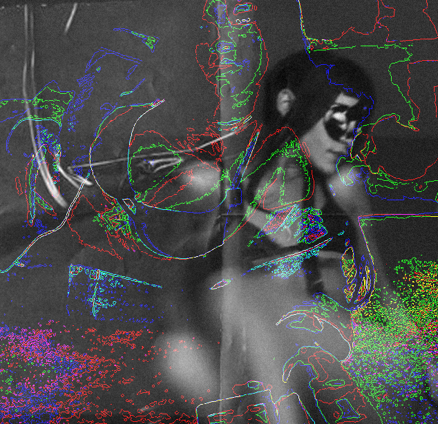
With this piece, I was going to continue using the same effect like I did for the previous ones. For the background image I went with the theme which is more “bdsm” look to the photo. The reason why I went for these types of images were that they were easy to contrast with, looks more simple in my opinion.

