Categories
In Real Life

Experiments

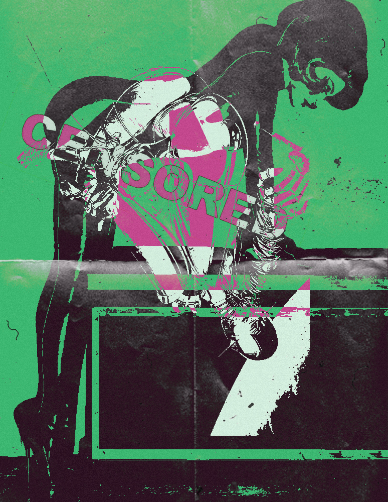
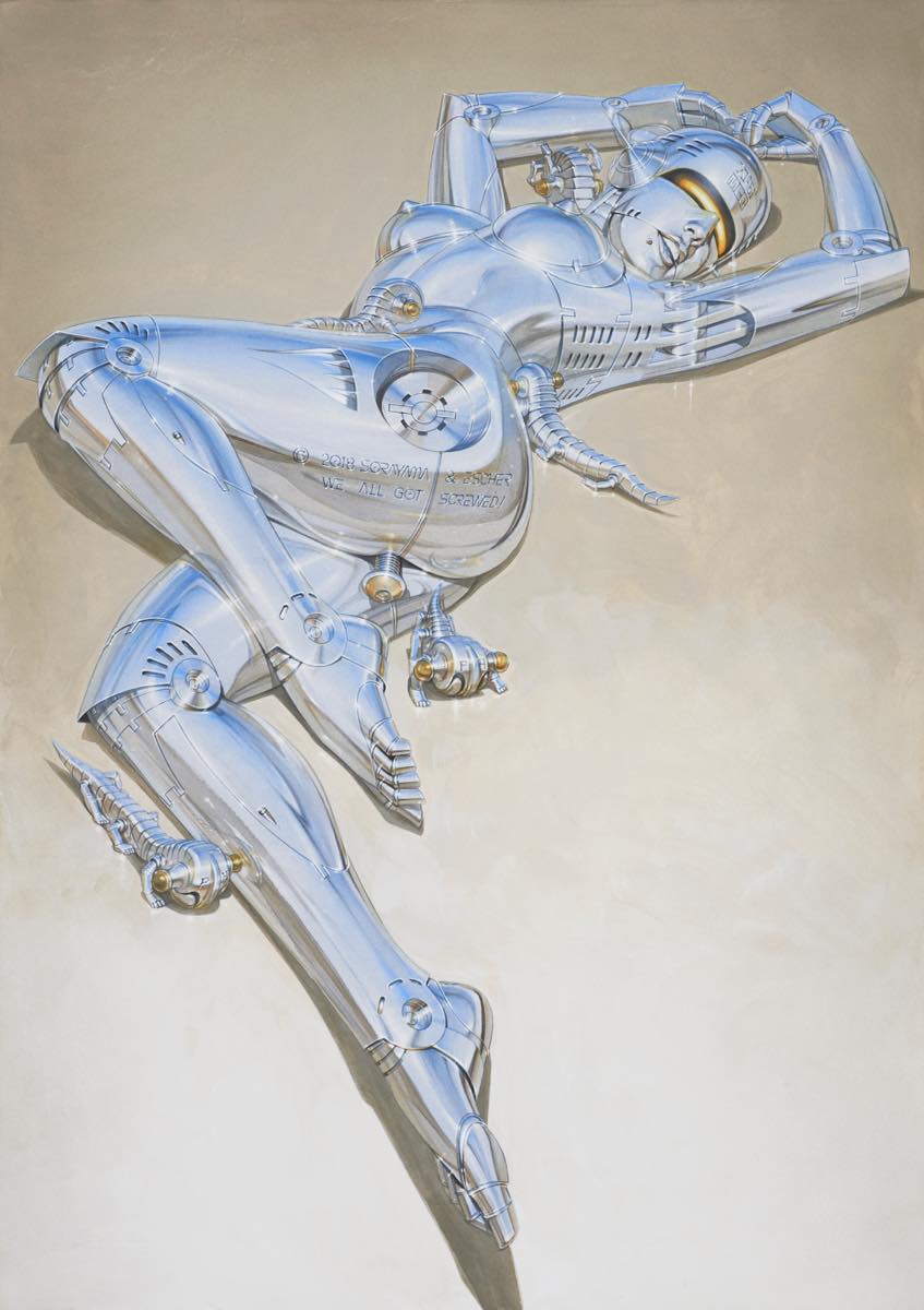
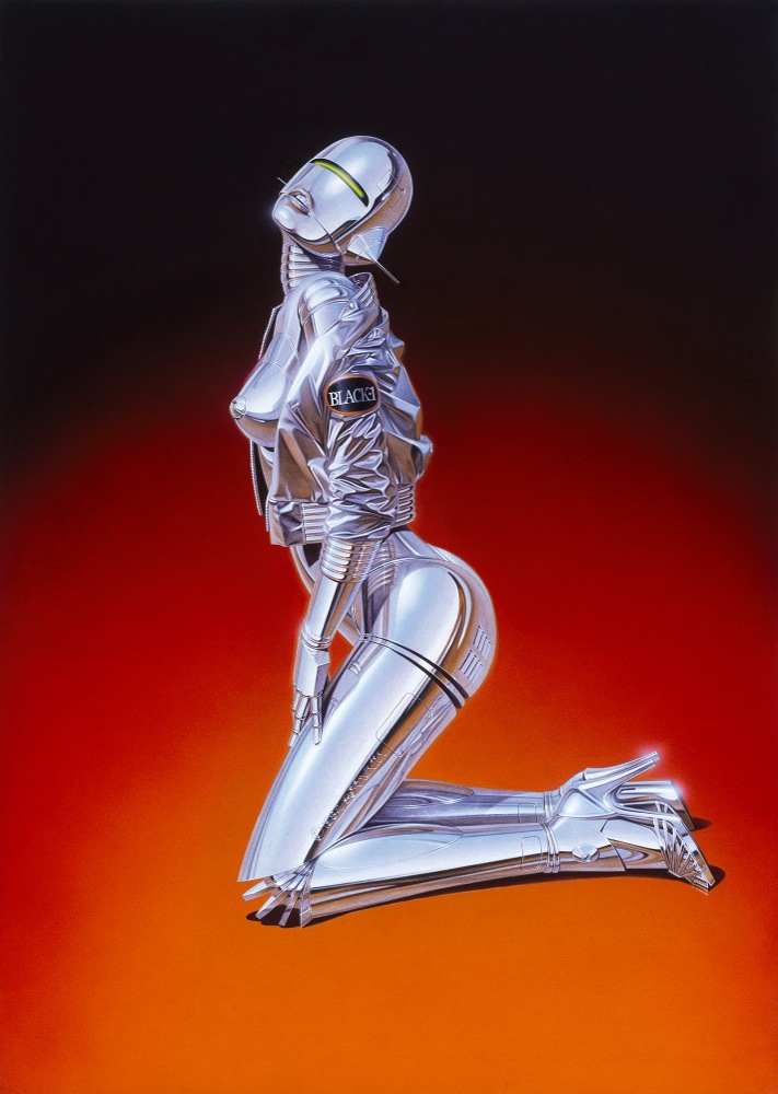
After looking at Hajime Sorayama, I wanted to play around with his style and try to make sense of what direction I want my project to go in next.
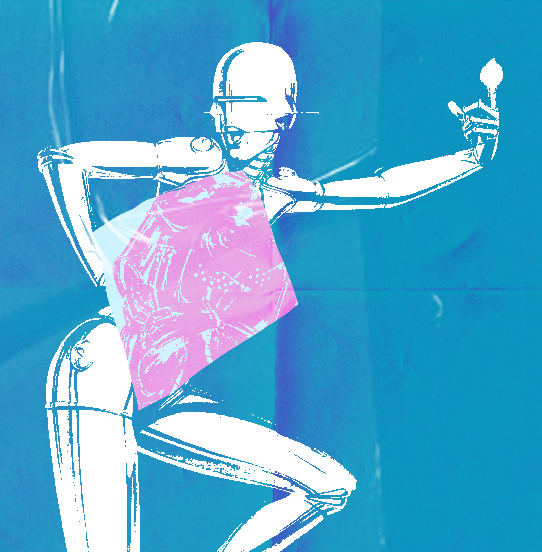
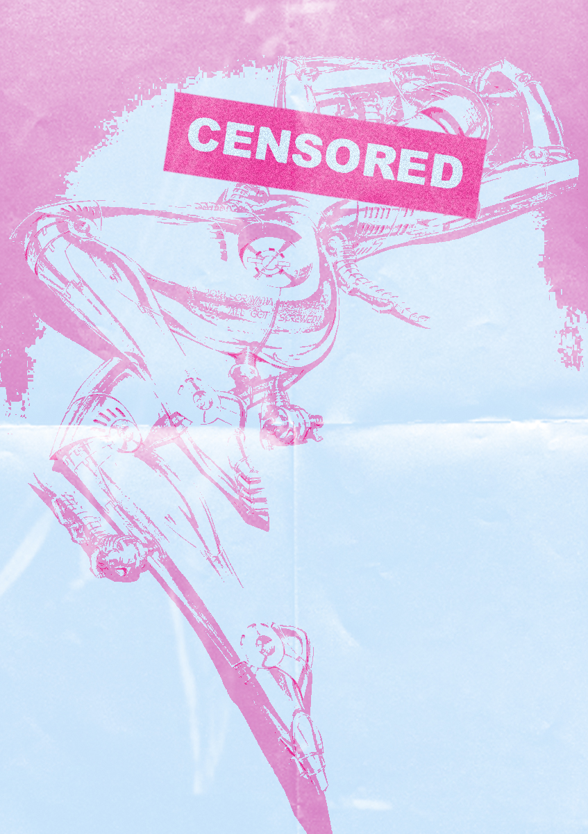
Going off from the two Hajime pieces above I wanted to follow the same look that he does. Most of his work are provocative and out there but without making it look trashy. The text isn’t really major part of the image I wanted to feature it because with the effect on it I like how it go with the overall piece and the colour palette.
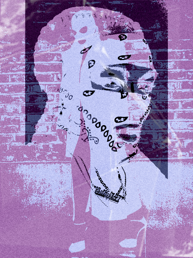
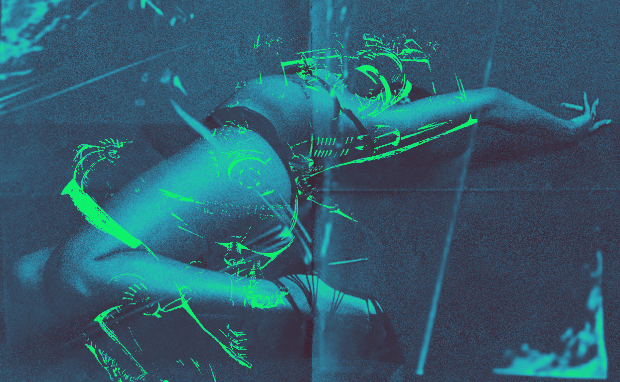
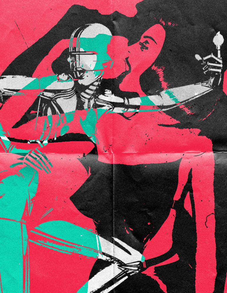
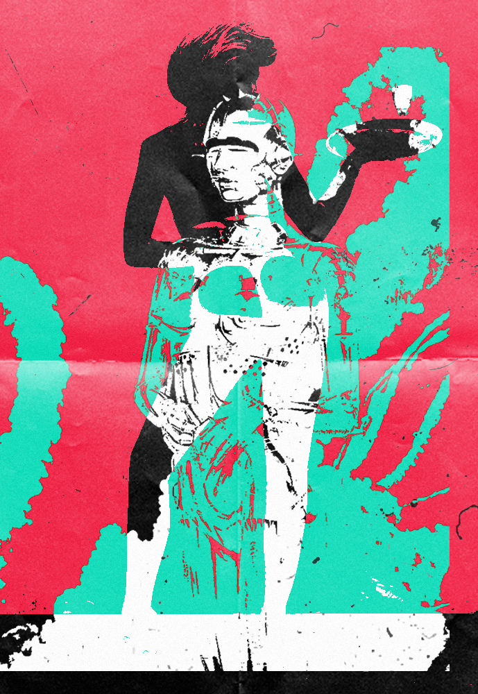
From the first piece, I wanted to explore the more graphic effect so these two pieces were a result of that.
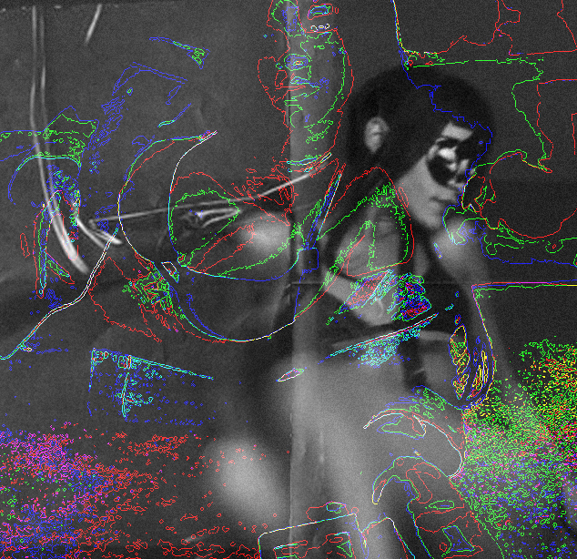
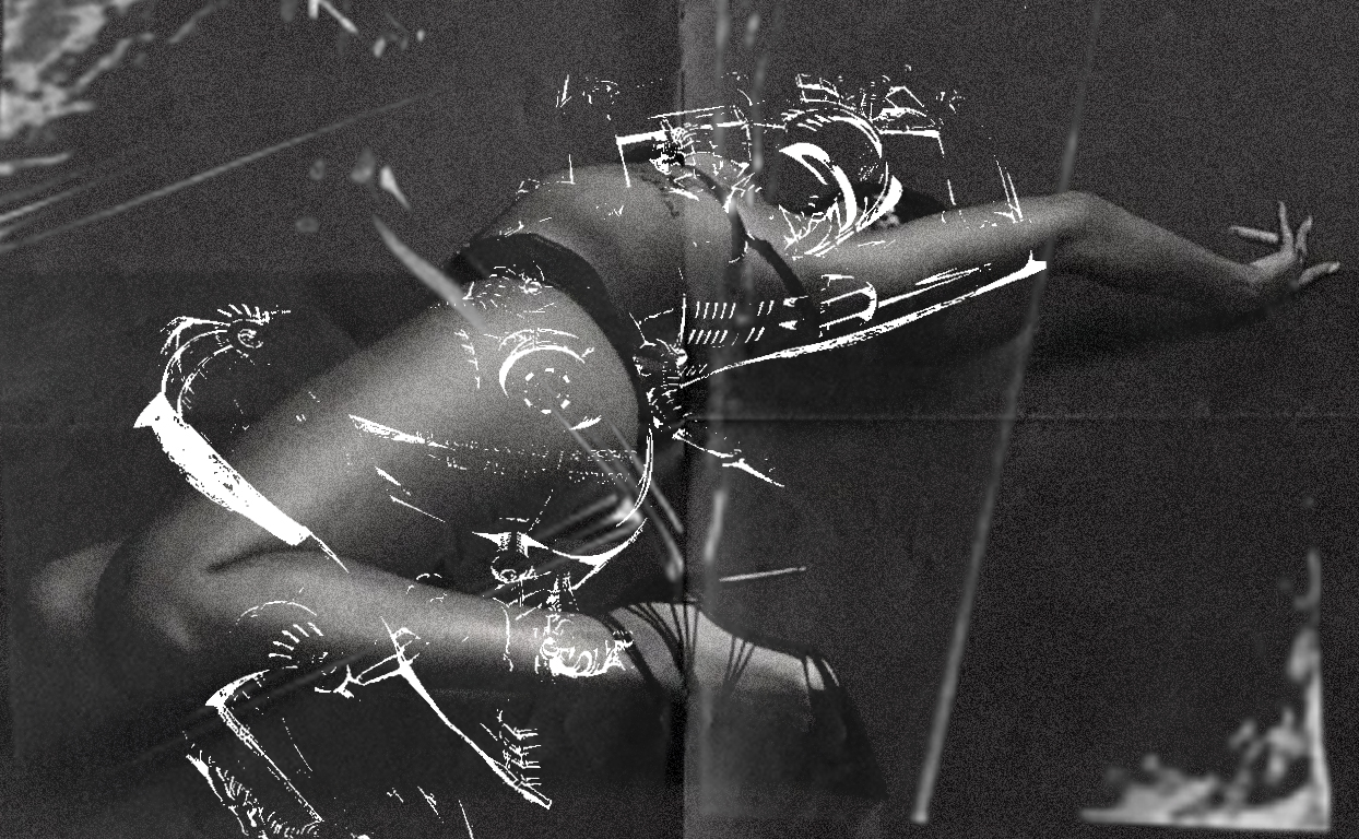
With this piece, I was going to continue using the same effect like I did for the previous ones. For the background image I went with the theme which is more “bdsm” look to the photo. The reason why I went for these types of images were that they were easy to contrast with, looks more simple in my opinion.
Categories
In Real Life

Hajime Sorayama

Hajime Sorayama is a Japanese illustrator known for his his precisely detailed, erotic portrayals of feminine robots. Sorayama’s designs are a blend of fine art, illustration, and industrial design, developing his unique style of ‘superrealism’. He has collaborated with brands such as Medicom Toy, X-LARGE, and British Knights.

Dior X Hajime Sorayama:

Dior Men’s creative director, Kim Jones, saw an exhibition by Japanese artist Hajime Sorayama at Tokyo’s Nanzuka gallery. Kim Jones inspired by Sorayama’s meditations on the limitations of desire, which the artist explores through his hyperreal, erotic fembot sculptures, crafted from silver Mylar—felt the artist would be the perfect collaborator on a collection dedicated to Japan’s innovative advancements in AI and robotics. 

“I describe my collaboration with Kim as two weirdos having fun,” says Sorayama, a prominent contemporary talent in his home country. “Kim has great artistic vision. As a creative myself, I could see this from the beginning.”

What I’m taking from Hajime Sorayama:

In the sense of where i’m going with this project, I wanted to feature this artist cause of his look at the female body because a certain aspect of my project that focuses on the two sides of body image. The more over exaggerated body that lives in digital world vs the every day bodies that are seen everyday.

Categories
In Real Life

Moving Forward:

For my project to go into the next stage, I would have to take a back seat on how the visual side of the project was going and focus on the concept and topics that my work are going to talk about. Anthony suggested instead of just vaguely looking at women’s right that I make it more specific. Looking at different subjects within. For example: body image, menstrual cycle and more serious case topics like rape.

The Perfect Body

So, I ran with the idea of body image and how there this idea that there’s this “perfect body”. I went for this imagery, most model are called hangers thats essential their job to make the clothes look good. Instead of putting the same body type I went for three types of body types that are contrasting. The middle body would be seen as the body to have today whilst the other two opposite from the middle one.

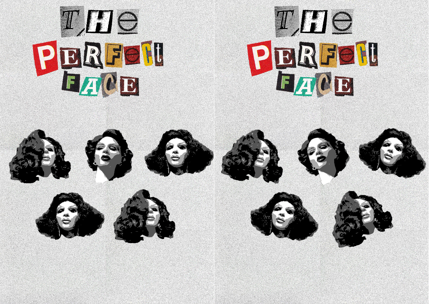
The Perfect Face

Following with the same idea of body image. I went on to make a gif. The original idea for this gif was to comment on plastic surgery but overall I don’t think that the message came across.

PERIOD.

Moving away from the topic of body image, I wanted to make a piece about menstrual cycle. So I went with an obvious imagery, its really simple. Would probably make a variation of this.

Broken Face

For this piece the main idea was that I wanted to enlarge certain bits of a persons face. Don’t know what how it could relate with body image but I needed to get down just to get a visual. Also wanted the piece to have texture to, so I added a load of overlays of cello tape and crumpled paper.

Categories
In Real Life

Keiichi Matsuda

Keiichi Matsuda is a London based artist who is a designer and film-maker. Matsuda mixes Japanese and British origins. His work has been widely exhibited, from London’s V&A Museum to New York’s MoMA, as well as attaining viral success online.

Keiichi Matsuda: Hyper Art

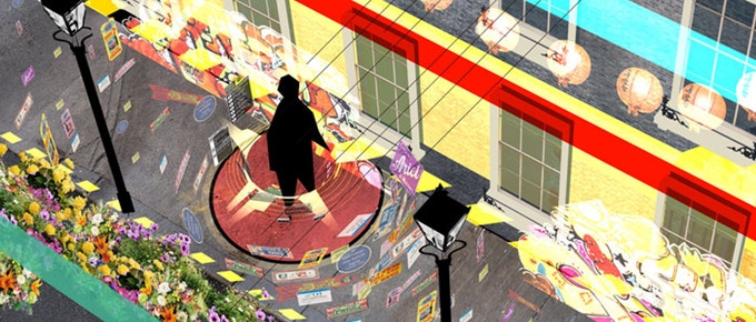
Keiichi Matsuda directed the video installation called “Hyper-Reality”. It shows the blend between augmented reality and actual reality. Matsuda explores connected environments also using interactive installations, where he reprocesses and makes visible the information that permeate the city every day, which is not perceivable separately through our devices. 

What would I incorporate from Keiichi Matsuda’s work into mine?

From his work, I would incorporate the idea of augmented reality blending into actual reality. Visually speaking, I find his concept drawing for his installations interesting as its kind of a window into his thought process.

Categories
In Real Life

Gifs with an agenda

This is a continuation of the type of format I wished to use but instead of it being random images without meaning. This time I’m going to find a way to comment about topics that find interest in. The goal here is to incorporate text and imagery.

For my first gif, I had the instant idea to go back and look at previous idea for survival. My initial ideas for “Survival” were to look at female rage. I decided to revisit this topic with images from Halsey’s Nightmare music video. Which literally a massive ‘Fuck You’ to the patriarchy.

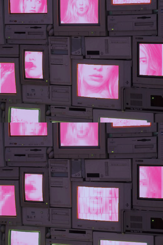
The initial idea for this one was to look at objectifying the female body but not like in a disgusting way. But I don’t think that executed right and I tried to add text but its look more as an after thought than something that was supposed to be there.

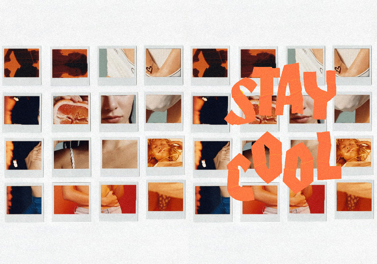
Still had the idea of looking at the figure, instead of using tv screens for the background. I used polaroids instead because I came across this photoshoot for Calvin Klein. The colour palette for this shot its a lot warmer than the previous. Went onto decided that the images on the polaroids were not going to be moving this time only the text.

This one has a clear message behind. Women’s rights: through history. Wanted to continue on using different backgrounds, resulting in a film. Went for text that was kind of obvious to the image just to ‘hit the nail on the head’ even more.

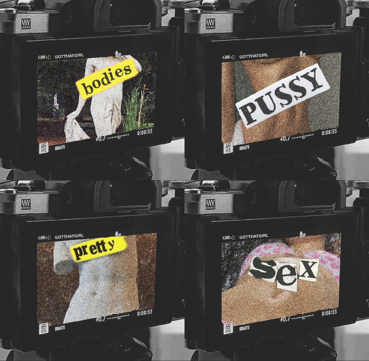
This gif is like a variation on the second gif. I definitely had more of an idea of what imagery I wanted to have and the text that would be alongside it. Like the women’s right gif I wanted to be ‘now vs then’ type of look to it. So I chose greek statues of women and women of now. Using text from ‘Sex Pistols’ to plaster over these women’s bodies.

Categories
In Real Life

Nam June Paik

Nam June Paik pioneered the use of video with the topic of the internet. The artist Nam June Paik was born in Seoul, Korea on 20 July 1932. Nam June Paik work has always commented on the curiosity of the future of technology and the internet.

Nam June Paik’s work varies from genre, sculptures, performances, music and live broadcasting. His art reflects a fascination with philosophies and traditions of both Eastern and Western cultures.

TV Garden:

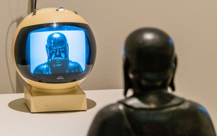
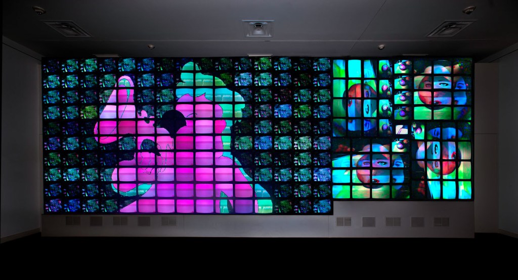
TV Garden 1974 – 77, Paik imagined a future landscape where technology is an integral part of the natural world. Placing TV sets alongside live plants, he creates an environment in which the seemingly distinct realms of electronics and nature coexist.

His approach follows the Buddhist belief that all things are interdependent and closely connected. It also suggests that technology is not conflict with nature but an extension of the human realm

The TV sets display Paik’s Global Groove 1973. This colourful, fast paced video mixes high and popular cultures, with imagery from traditional and contemporary, Western and non-Western sources. It captures the disparate and sometimes overwhelming content of contemporary mass media.

What aspects of his work would I incorporate in my work?

Nam June Paik’s ideology is the main influence to my topic and concepts. I would like to take how he blends the two states of nature and technology and combines them, to make an interesting thing. Sometimes his work is literal but I like how subtle the visuals are.

Categories
In Real Life

Hypno pixilation

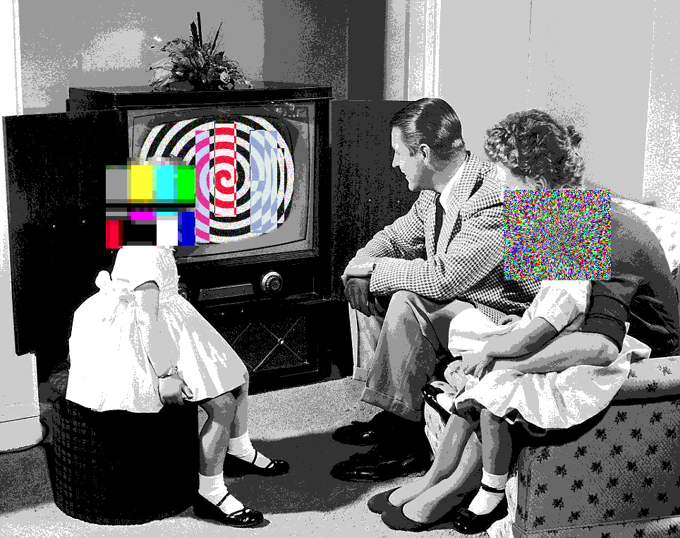
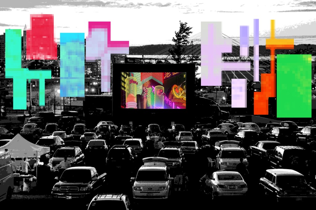
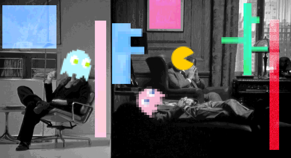
The idea behind these photomontages is that I took Douglas Couplands love for pixels and combined them with the idea that the internet is feeding into reality.

This is quite a literally. What I was trying to say with this photomontage, tv brainwashing the youth. But doesn’t effect the adults. Went for more iconic tv screens on the kids cause you get a clear understanding of whats its about with the black and white spiral background. Its makes it obvious thats its about hypnotising the young.

The concept is the same, still touches on the hypnotic side of the internet but I wanted to showcase like the internet glitching into our world. If that make sense. Thats why there different colour blocks but there all pixelated. The

With this on I wanted to be more literally with my message. But this time, i wanted to use iconic game characters but in the context of my concept. Throughout the photomontages I use vintage images cause there such a contrast between the Black & White images to the solid colour blocks throughout the piece.

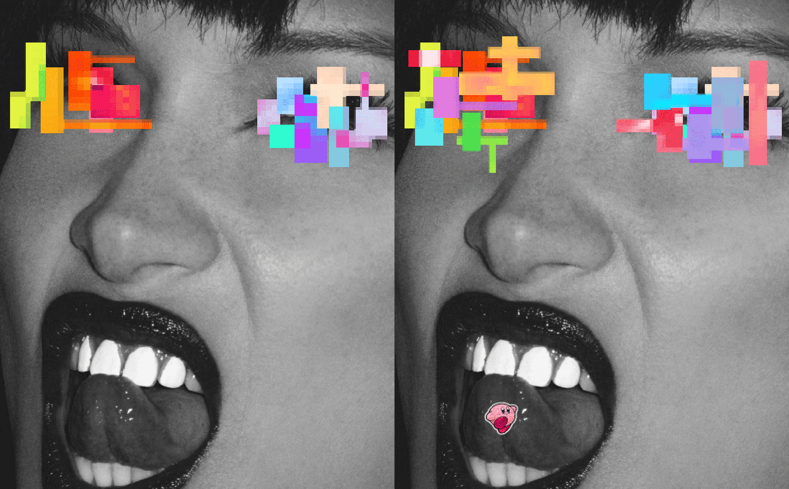
For the last three images are standstill and I remember talking to Jason & Becky about how I was going to make my work. Jason said something about how my previous photomontages were static and whether I would want to work on movement.

So just to experiment, I used an image of Bella Hadid and put the same elements as the last images but with a Kirby sticker. Added that cause it reminded me of those “sticker drugs” with different characters.

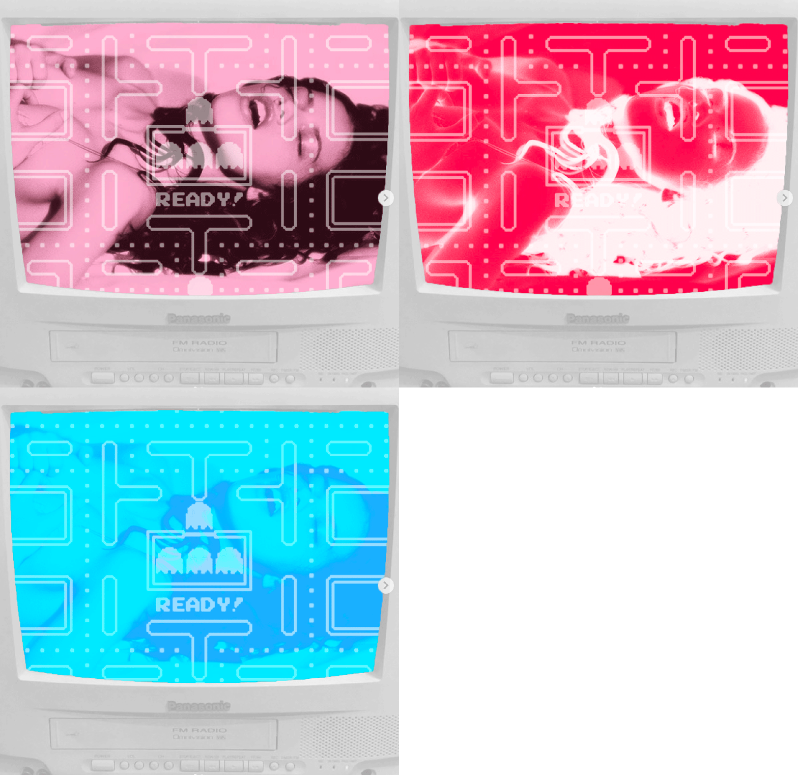
Similar to the last one, I just wanted to explore more on making GIF’s. This piece I would stay is recreation of some kind. To the work of Nam June Paik especially his “TV Garden” which was featured in the Tate Modern.

What I took inspiration from is that throughout the “garden” the tv’s were just playing multiple of images/ videos some where just the news whilst others were provocative. I lean more towards using “more out” imagery but layered on top of it is the Pacman starting screen.

Categories
In Real Life

Douglas Coupland

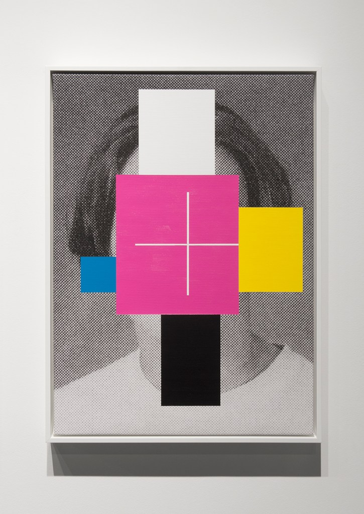
Douglas Coupland is an Candian novelist and artist. His visual work looks into themes like curiosity with the corrupting and seductive dimensions of pop culture and 20th century pop art. Douglas Coupland takes great inspiration from Andy Warhol’s work.

Micro Manifestos:

“Slogans for the 21st Century” by Douglas Coupland. Douglas used Copenhagen as his personal exhibition when he decided to put up 500 posters overnight. The slogans aim to challenge and describe the thoughts and ideals governing contemporary societies. Coupland also chose slogans that relate to life online and offline. With these slogans he also comments on questioning the media platforms that create our behaviours and interactions, from Facebook to Tinder.  

Image result for douglas coupland

What am I going to take from him?

His visual choice with pixelating certain bits ion his art is an really interesting choice and I would love to incorporate that style choice into my work.

Also in terms of visual, the way that he colour block his piece is definitely something that i will be considering throughout my work.

Categories
In Real Life

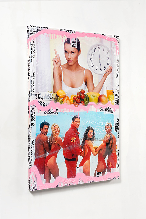
Mazaccio & Drowilal

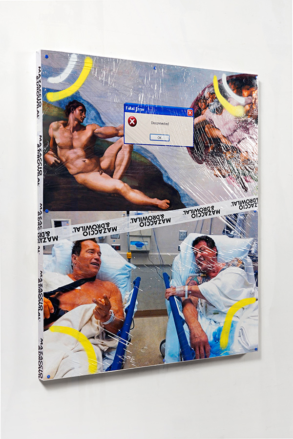
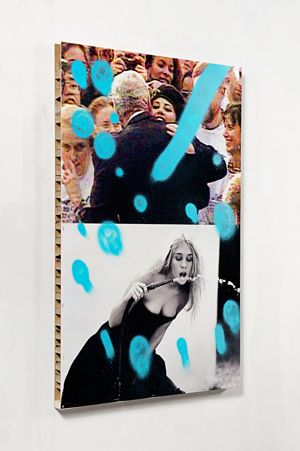
Mazaccio and Drowilal are a French duo that use images from the internet and defaces them using spray paint and tape. By using these mediums there work comments on how mass media is shaping dreams and identity.

The genre of work that they produce falls into the category of “Iconology”. Iconology looks at the study of visual imagery, symbolism, and interpretation.

Elise Mazaccio and Robert Drowilal have been working as a collaborative duo since 2009 when they began creating self-published photo-books.

“The idea was to make edits, or snapshots, by collaborating and denying the concept of image authorship,”

The images are drawn from Instagram, Tumblr and Pinterest.The duo work with a wide range of images, from advertising and stock imagery, to cartoons and internet memes.

“For us, the work of art is part of this huge tank of images that are shaping the imaginary. It’s all about deconstruction and parallels.”

What am I going to take from their work?

The concept that the comment in their work is interesting. I like how have two different mediums combined into one. The idea would be that I would produce photomontages that look at the internet vs reality with a brainwashing theme throughout. Hopefully. I want to blend my drawing skills with my photoshop skills this time around.

Design a site like this with WordPress.com
Get started